An architecture concept sheet is a single composed layout that carries a project's drawings, diagrams, and narrative together on one board. A strong one doesn't just show the design , it argues for it, guiding a juror's eye from idea to outcome in the few seconds they'll actually spend looking at it.
If you've ever walked into a jury with a board that had everything on it , every plan, every render, every line of your concept note , and still watched the panel's eyes glaze over, you already know the problem isn't your design. It's how you're presenting it.
Also Read : Architecture portfolio must-have tips and tools
What Is an Architecture Concept Sheet?
Quick answer: it's a composed layout that communicates design intent, not just a collection of drawings. Think of it less like a folder of your work and more like a single page trying to make one clear argument.
A lot of students confuse a concept sheet with just "the sheet with the diagrams on it." It's more specific than that. The concept sheet is where you're translating an idea , massing logic, a response to the site, a material philosophy, whatever your big move is , into something visual enough that someone can get it without you standing there explaining. Your presentation sheet, later in the process, does something slightly different: it shows the resolved design. The concept sheet earns you the right to that resolution.
What Should a Concept Sheet Include?
Here's the checklist version, because honestly this content type reads faster as a list than as three paragraphs of prose:
- A concept statement , one or two lines, not a paragraph. If you can't say it short, you probably haven't nailed it down yet.
- Site context , enough to show you understood the constraints, not the entire site analysis dumped onto the page.
- Key diagrams , massing, zoning, circulation, whatever explains the "why" behind your design.
- A plan or section , something technical that grounds the concept in reality.
- Material or palette references , even a rough one signals you've thought past the idea stage.
- A narrative thread , some visual or textual cue that tells the viewer where to look first, second, third.
Miss two or three of these and the sheet still works. Miss all of them and you've basically made a mood board with delusions of being a concept sheet.
Also Read : Guide on how individual sheets come together into a full portfolio
Sharpen your visualization skills with Kaarwan's Visualisation & Rendering Course — build render and presentation skills you can use right now.
How Do I Lay Out a Presentation Sheet? (Grid, Hierarchy, Flow)
Quick answer: start with a grid, pick one dominant element, and build everything else around it in a deliberate reading order , usually left to right, top to bottom, but not always.
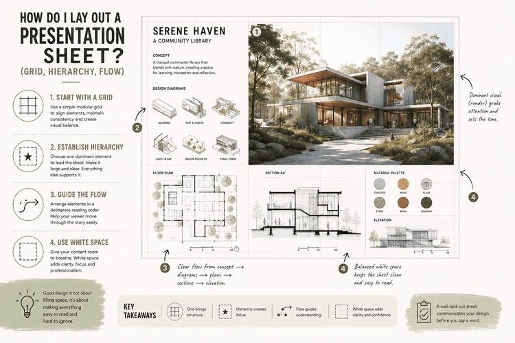
The grid is your skeleton. It doesn't need to be complicated , a simple modular grid keeps your drawings aligned and stops the sheet from looking like everything got dropped in at random. Once the grid's there, decide what's carrying the sheet. Is it your render? Your section? Your isometric? Pick one, let it be big, and let everything else be smaller and supporting.
Flow matters more than people give it credit for. A juror shouldn't have to hunt for where to start reading your board. If your concept statement is buried in a corner and your smallest diagram is dead center, you've built confusion into the layout before anyone's even read a word.
One thing worth internalizing early: white space isn't wasted space. It's doing work. A sheet crammed edge to edge reads as anxious , like you didn't trust the content to stand on its own. A sheet with room to breathe reads as confident.
From Site Analysis to Final Sheet , The Full Process
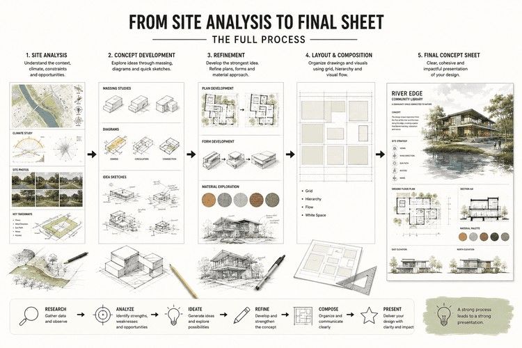
A concept sheet doesn't come out of nowhere. It's the endpoint of a process that starts with actually understanding your site — climate, context, constraints, the works. If you're still figuring out how to gather and structure that data, start with a thorough site analysis sheet before you even open your layout software. Skipping straight to composition without that groundwork is how you end up with a sheet that looks nice but says nothing.
Link for that anchor: How to Create an Architectural Site Analysis Sheet: A Complete Data Collection Guide
Once the analysis is done, concept development bridges the gap , that's where your massing studies, your diagrams, your "big idea" get worked out on scrap paper or in quick digital sketches before they ever touch a final layout. Only after that should you be thinking about grids and hierarchy. Students who skip straight to InDesign without this groundwork tend to produce sheets that look busy but don't actually say anything.
Common Mistakes Students Make on Presentation Sheets
A few patterns show up over and over in student work, semester after semester:
- Cluttered layouts. Everything gets equal visual weight, so nothing reads as important. If your smallest diagram is the same size as your hero render, the sheet has no hierarchy at all.
- Weak concept statements. Either too vague ("this design responds to its context") or too long (a full paragraph nobody's going to read in a jury setting).
- Inconsistent typography. Three fonts, five sizes, random bolding. It reads as indecisive even if the design underneath is solid.
- Poor visual hierarchy. Related to clutter, but specifically about not guiding the eye , no clear starting point, no logical path through the content.
- Ignoring scale references. A gorgeous render with no people, cars, or trees to give it scale can actually undersell how good the design is.
None of these are hard to fix once you can name them. That's honestly half the battle , being able to look at your own sheet and recognize which mistake you're making.
Tools for Building Presentation Sheets
Most students end up working across two or three programs rather than just one. InDesign tends to be where the actual sheet gets assembled , it's built for grids and multi-page consistency in a way Photoshop isn't. Photoshop comes in for compositing renders, color correction, and general image polish. Illustrator handles vector diagrams and icons cleanly, especially anything you'll want to resize without it turning blurry.
If Photoshop is where you're spending most of your layout time, it's worth getting genuinely fluent in it rather than just getting by — our Photoshop techniques for architectural presentations, from templates to advanced layer work and advanced Photoshop tips for architectural presentations guides cover a lot of ground here, and our guide to mastering architectural renderings in Photoshop is worth a look too.
Also Explore : Getting strong presentation-ready views directly out of Revit
On the modeling and rendering side, most students are pulling drawings straight out of Revit or AutoCAD, then bringing them into SketchUp or Rhino for 3D work, before rendering out through something like Lumion or V-Ray. If Revit's your primary tool, it's worth knowing it can get you most of the way to presentation-ready views without ever leaving the software — our guides on getting strong presentation-ready views directly out of Revit and Revit lighting tricks to boost your design presentation both dig into that.
Also Explore: Revit lighting tricks to boost your design presentation
Quick note on export settings, since this trips up more students than it should: 150 DPI is fine for digital submission, but if there's any chance your sheet gets printed, export at 300 DPI. Nothing sinks a good design faster than a pixelated render at A1 size.
Example Breakdown , What Makes a Sheet Work
Picture a strong student sheet built around a single dominant isometric , the kind that takes up maybe 40% of the board.
Around it, smaller supporting diagrams sit in a consistent grid: a massing study top-left, circulation diagram bottom-left, material callouts running along the right edge in a narrow column. The concept statement sits just under the header, two lines, nothing more.
What makes it work isn't the individual drawings , plenty of average sheets have equally good renders. It's that every element on the page is doing a specific job and nothing's fighting for attention. The eye lands on the isometric first because it's biggest, then naturally drops down to the supporting diagrams because they're smaller and positioned in a logical sequence.
There's a consistent color language tying the diagrams to the render (same accent color used for circulation arrows and for one material swatch), which is a small touch, but it's the kind of detail that makes a sheet feel intentional rather than assembled last-minute at 2 AM.
Compare that to a weaker version of the same content: same drawings, same information, but scattered without a clear grid, three different fonts, and a concept statement crammed into a leftover corner because there wasn't room left after everything else got placed. Same content. Completely different read.
A Closing Thought
Your concept sheet is never really about the drawings themselves , plenty of average designs get elevated by a sheet that knows how to argue for them, and plenty of strong designs get buried by one that doesn't. Treat the layout as seriously as you treat the design, and juries notice. So does the version of you looking back at this portfolio in five years.
Be the first to know when the Photoshop Architectural Sheet Presentation Masterclass launches , get notified the moment it opens and lock in early access.
Frequently Asked Questions
What size should an architecture presentation sheet be?
A1 and A2 are the most common sizes for printed student sheets, though your studio or competition brief always overrides general convention , check that first before assuming.
How many drawings should go on one sheet?
There's no fixed number, but fewer, larger, well-organized drawings almost always beat a crowded sheet with everything crammed in. If you're unsure, it's better to cut a drawing than to shrink everything to fit.
What software do architecture students use for presentation sheets?
Most combine InDesign for layout, Photoshop for compositing and color work, and Illustrator for diagrams , alongside Revit, AutoCAD, SketchUp, or Rhino for the underlying drawings and models.
How is a concept sheet different from a presentation board?
A concept sheet focuses on communicating the idea behind a design , the "why." A presentation board (or final sheet) shows the resolved, detailed design , the "what." Most projects need both at different stages.