Color is one of the most influential tools in UI design. It’s more than just decoration — it speaks directly to users’ emotions, guiding their journey through an app or website. The right color combination can drive engagement, build trust, and even influence purchasing decisions. Understanding color psychology allows designers to craft immersive experiences that align with user needs and brand identity.
In this blog, we’ll break down how different colors evoke specific emotions, best practices for applying color to user interfaces, and tips for ensuring accessibility and consistency across designs.
The Role of Color Psychology in UI
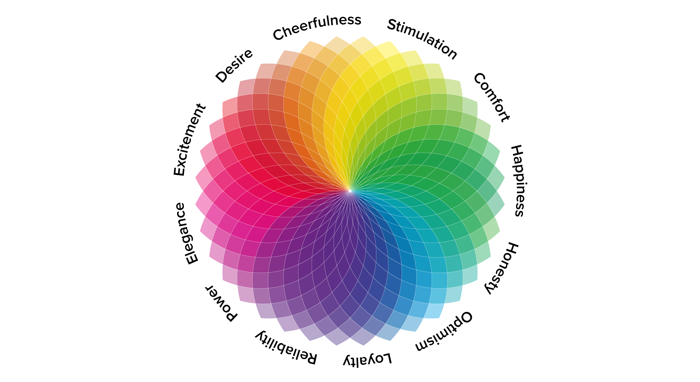
Color psychology studies how colors influence human emotions and behaviors. In UI design, this translates into creating digital experiences that feel intuitive and memorable. Users may not consciously recognize why they find certain interfaces appealing, but the emotional responses triggered by color play a significant role.
A well-designed color palette improves readability, highlights key elements, and provides structure. Conversely, poor color choices can result in confusion or lack of engagement.
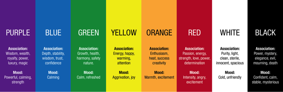
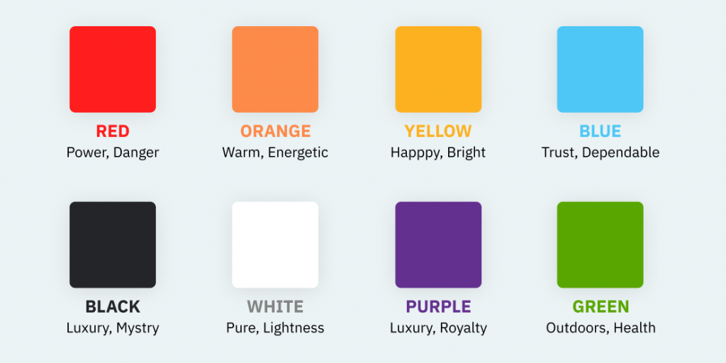
Breaking Down Color Emotions: A Guide for Designers
1. Red – Energy and Urgency
Red is bold and intense. It demands attention, symbolizing excitement, passion, or even danger. Brands use red strategically to trigger urgency or signal important actions.
Best Uses:
- Call-to-action (CTA) buttons
- Error messages or alerts
- Limited-time offers
Example: Red CTA buttons are often used in e-commerce platforms to drive users towards completing a purchase.
2. Blue – Trust and Calmness
Blue conveys a sense of security and reliability. It’s frequently used by technology companies, healthcare brands, and financial institutions due to its association with stability.
Best Uses:
- Backgrounds for professional websites
- Security and data sections
- Communication platforms
Example: Facebook and Twitter both utilize blue to promote trust and calm interactions.
3. Green – Growth and Positivity
Green symbolizes growth, nature, and balance. It’s often linked to eco-friendly brands or wellness applications, reinforcing themes of health and progress.
Best Uses:
- Success messages
- Progress bars
- Apps related to finance, health, or sustainability
Example: Apps like Spotify use green to communicate creativity and growth.
4. Yellow – Optimism and Attention
Yellow radiates energy and warmth, creating a sense of optimism. However, overuse can lead to visual strain, so designers should apply it in small doses to grab attention without overwhelming users.
Best Uses:
- Highlighting notifications
- Tips or onboarding messages
- Accentuating minor UI elements
Example: Snapchat’s signature yellow interface embodies fun and youthfulness.
5. Black – Sophistication and Power
Black exudes elegance and simplicity. It adds contrast, making other elements pop. Black is widely used in luxury brands and minimalist designs.
Best Uses:
- Highlighting premium features
- Creating contrast
- Clean, minimalist layouts
Example: Apple’s extensive use of black and white reinforces its sleek, high-end product design.
Building a Cohesive Color Palette for UI
Creating a harmonious UI starts with a thoughtfully chosen color palette. A balanced palette ensures that users focus on the right elements without feeling overwhelmed.
Core Components of a UI Color Palette:
- Primary Color: Reflects the brand’s identity and serves as the base of the design.
- Secondary Color: Complements the primary color to add depth and variation.
- Accent Color: Draws attention to CTAs, links, and interactive elements.
- Neutral Colors: Used for text, backgrounds, and borders to maintain readability.
Ensuring Accessibility Through Color
Accessibility is a key factor in UI design. The right color choices ensure that interfaces are usable for people with visual impairments or color blindness. Designers must prioritize inclusivity by adhering to accessibility standards.
Tips for Accessible Color Design:
- Maintain high contrast between text and backgrounds.
- Use symbols and text to supplement color-coded elements.
- Test designs with contrast-checking tools.
Cultural Implications of Color Choices
Colors hold different meanings across cultures. A color that evokes positivity in one region might signify something entirely different elsewhere. Global products should account for these cultural nuances to avoid alienating users.
Example: While white signifies purity in Western cultures, it represents mourning in some Asian cultures.
Color in Action: UI Applications
1. CTA Buttons
Bright, contrasting colors help CTA buttons stand out, improving click-through rates and driving user actions.
2. Highlighting Key Content
Color can separate important headings, links, and messages, ensuring users don’t miss critical information.
3. Feedback and Notifications
Colors provide feedback through success (green), errors (red), and warnings (yellow), creating a clear communication channel between the system and the user.
Testing and Refining Color Choices
No UI design is complete without testing. A/B testing various color combinations can reveal user preferences and maximize engagement.
Testing Techniques:
- Conduct A/B tests for CTA buttons and alerts.
- Use heatmaps to track interaction with color-coded elements.
- Gather feedback through surveys and usability testing.
Conclusion: Designing with Color for Maximum Impact
Color is a silent guide in UI design, influencing users’ decisions and experiences. By strategically applying color psychology, designers can create interfaces that feel intuitive, engaging, and trustworthy.
The key lies in balance—thoughtfully choosing colors that align with the brand while ensuring accessibility and emotional resonance.
Master the art of crafting intuitive interfaces and unforgettable user experiences with our Advanced UI/UX Design Course. Gain hands-on skills, elevate your career, and create designs that leave a lasting impact.
Enroll now at Kaarwan and take your expertise to the next level!
FAQs
1. How can color impact user engagement in UI design?
Colors influence user mood and actions, enhancing engagement and guiding users through the interface intuitively.
2. What is the best color for CTA buttons?
Bright, attention-grabbing colors like red, orange, or green are ideal for CTA buttons.
3. How can I ensure color accessibility in my design?
Use high-contrast color schemes and supplement color with labels or icons.
4. How does color choice affect branding in UI design?
Color reinforces brand identity, evoking specific emotions that align with the company’s values.
5. Why is cultural awareness important in UI color selection?
Colors carry different meanings globally, and understanding these differences ensures designs resonate with diverse audiences.