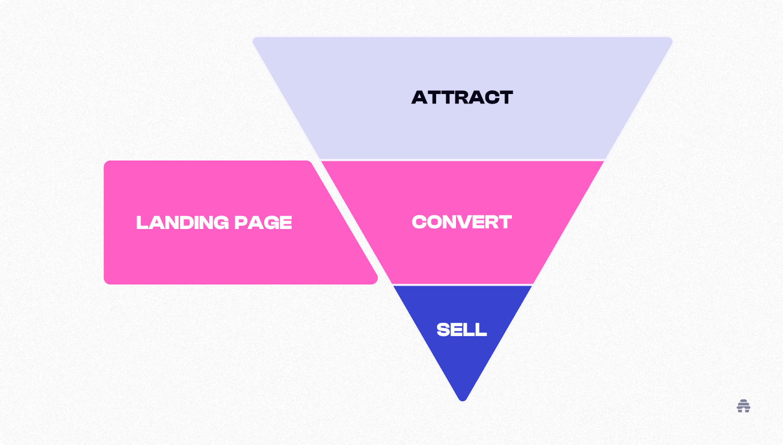
In the digital landscape, first impressions are everything. A well-crafted landing page serves as the entry point for visitors and often determines whether they stay, explore, or leave. An engaging landing page doesn’t just look good – it communicates value, builds trust, and drives action.
A high-performing landing page can elevate conversion rates, whether it’s for generating leads, promoting a product, or encouraging sign-ups. The combination of strategic design, persuasive content, and intuitive navigation creates an experience that resonates with users.
In this blog post, we’ll walk through the principles of designing landing pages that not only grab attention but also convert visitors into loyal customers.
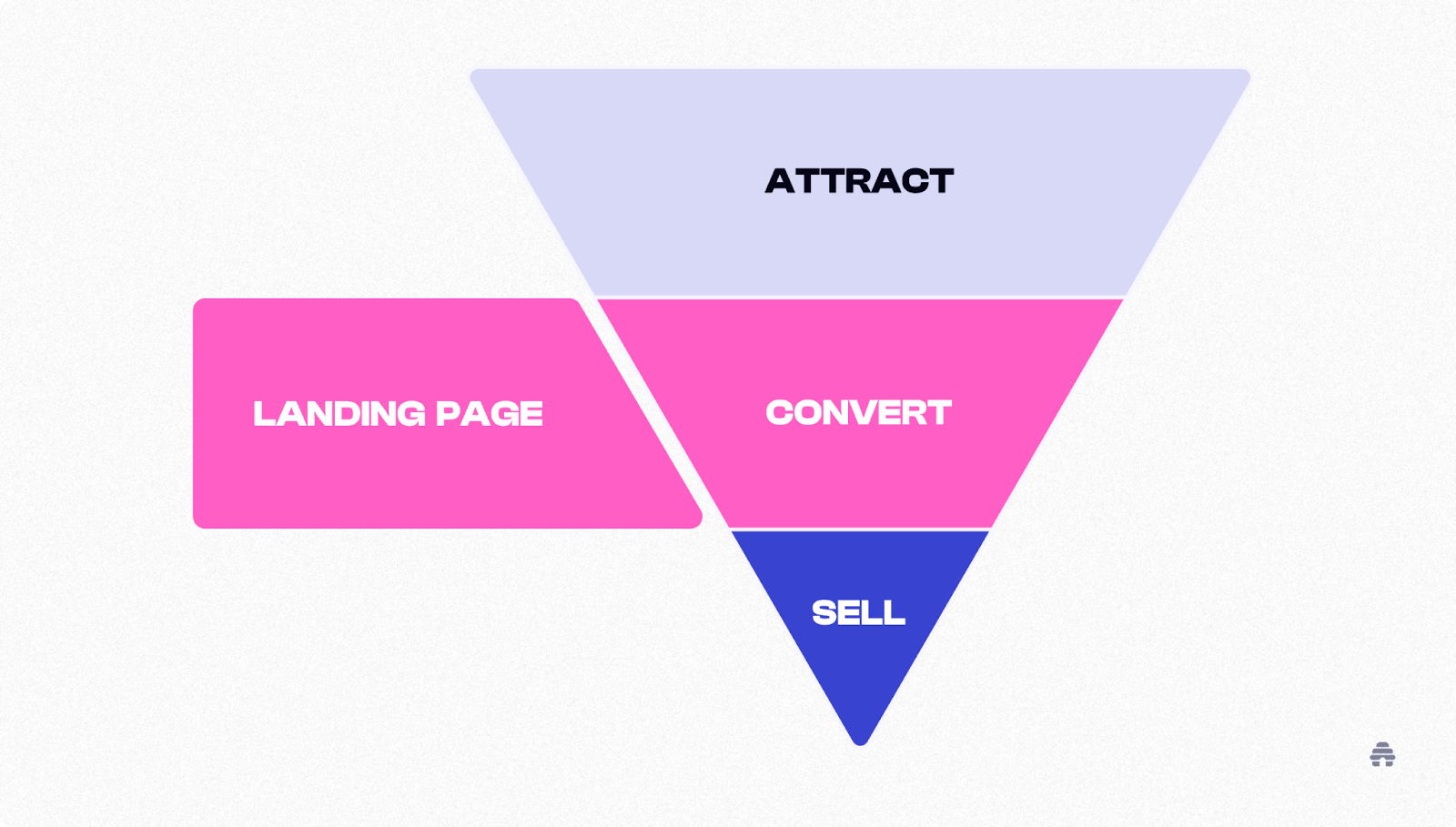
Understanding the Purpose of Landing Pages
A landing page is distinct from other pages on a website. It’s built with one goal – conversion. Unlike standard web pages that offer general information, landing pages focus on a singular call to action (CTA). This could mean downloading a guide, subscribing to a newsletter, or making a purchase.
Key Characteristics of High-Performing Landing Pages:
- Focused Messaging – Direct and concise, addressing a single offer or value proposition.
- Minimal Navigation – Fewer distractions to keep users focused on the action.
- Strong Visual Hierarchy – Prioritizing the most important elements to guide user flow.
Essential Elements of an Engaging Landing Page
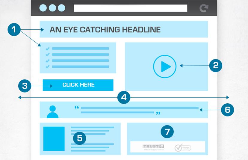
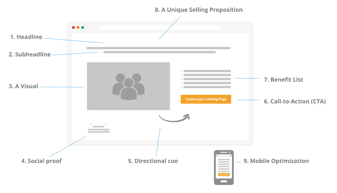
1. Captivating Headlines
The headline is the first thing users see. A compelling headline instantly communicates the value of the product or service. It should be:
- Clear and concise
- Benefit-driven
- Action-oriented
Example: Instead of “Our Software Solution,” use “Boost Productivity by 40% with Our All-in-One Software.”
2. Persuasive Subheadings
If the headline grabs attention, the subheading reinforces the message. This area should expand on the value proposition and explain why users should care.
Tips:
- Use persuasive, results-oriented language.
- Address user pain points directly.
3. Strong Call to Action (CTA)
The CTA is the driving force behind conversions. Whether it’s “Sign Up,” “Download Now,” or “Get Started,” the CTA should be:
- Highly visible (use contrasting colors)
- Action-packed (use verbs that drive urgency)
- Simple and direct
Best Practices for CTA Design:
- Use large, clickable buttons.
- Ensure CTAs are present above the fold (visible without scrolling).
4. Eye-Catching Visuals
Humans process visuals faster than text. High-quality images, videos, and graphics enhance the appeal of landing pages, making them more engaging and easier to digest.
Visual Tips:
- Use product demo videos to explain complex features.
- Include authentic images rather than generic stock photos.
5. Social Proof and Testimonials
Trust is a critical factor in conversion. By showcasing testimonials, reviews, and logos of reputable clients, you provide credibility and reinforce confidence.
Examples of Social Proof:
- Customer reviews
- Case studies
- Trust badges or awards
Design Principles for High-Converting Landing Pages
1. Simplicity and Minimalism
A cluttered landing page overwhelms users. Minimalistic designs, clean layouts, and plenty of white space ensure users stay focused on the message.
Focus Areas:
- Limit distractions.
- Remove unnecessary links or navigation.
2. Consistent Branding
A cohesive design aligned with brand guidelines strengthens recognition and trust. Use consistent fonts, colors, and tone of voice across all elements.
3. Mobile Optimization
More than half of web traffic comes from mobile devices. Ensuring that landing pages are mobile-responsive improves the user experience and boosts conversions.
Mobile Optimization Tips:
- Use responsive design.
- Ensure buttons are large enough to tap easily.
Crafting Copy That Converts
Landing page copy should be concise but powerful. Address user pain points directly, highlight benefits, and guide users toward action.
Copywriting Tips:
- Focus on the benefits, not just features.
- Use bullet points for easy scanning.
- Implement urgency by adding phrases like “Limited Offer” or “Act Now.”
A/B Testing for Better Performance
A/B testing involves creating two versions of a landing page to see which performs better. Testing different headlines, CTAs, or layouts allows you to refine elements that drive conversions.
What to Test:
- CTA button colors and placement
- Headline variations
- Visual changes
Landing Page Mistakes to Avoid
- Too Many CTAs – Multiple CTAs dilute focus. Stick to one primary action.
- Slow Loading Speeds – A delay of even one second can reduce conversions. Optimize images and streamline code.
- Lack of Clear Value Proposition – Users should immediately understand what’s in it for them.
Conclusion: Creating Landing Pages That Drive Results
Designing an engaging landing page is both an art and a science. By combining strong visuals, persuasive copy, and intuitive layouts, you can create experiences that captivate and convert. Always keep user needs at the forefront and continuously refine your designs through data-driven testing.
A landing page that resonates with users not only drives conversions but also establishes long-term relationships with your audience.
Master the art of crafting intuitive interfaces and unforgettable user experiences with our Advanced UI/UX Design Course. Gain hands-on skills, elevate your career, and create designs that leave a lasting impact.
Enroll now at Kaarwan and take your expertise to the next level!
FAQs
1. How long should a landing page be?
The length of a landing page depends on the complexity of the offer. For simple offers, keep it short and direct. For complex services, longer pages with detailed sections work best.
2. How many CTAs should a landing page have?
Ideally, one primary CTA. You can repeat the same CTA in different sections for better visibility.
3. What is the best color for CTA buttons?
Bright, contrasting colors like red, green, or orange work well. The key is to ensure the CTA stands out from the background.
4. How important is mobile optimization for landing pages?
Extremely important. A significant portion of users access landing pages through mobile devices, so a responsive design is essential.
5. How can I increase trust on my landing page?
Include testimonials, case studies, and trust badges. Visual proof of customer satisfaction builds credibility.