In the dynamic world of UI/UX design, understanding how users interact with elements is crucial. One of the most insightful frameworks to help designers create intuitive, aesthetically pleasing interfaces is rooted in Gestalt principles. These principles, based on psychological theories, explain how users perceive and organize visual elements, ultimately shaping their interaction with digital platforms.
While Gestalt principles originate from psychology, their relevance in UI design is profound. By applying these principles, designers can create layouts that feel intuitive, navigate smoothly, and provide a cohesive experience for users. Let’s dive into how you can leverage these principles to enhance your designs.
What Are Gestalt Principles?
The Gestalt principles are a set of perceptual theories that explain how people organize and interpret visual elements. The key idea behind these principles is that the human brain tends to perceive patterns and wholes rather than individual elements.
When it comes to UI design, understanding and applying these principles enables designers to create layouts that users can easily interpret and engage with. By aligning your designs with these psychological insights, you ensure that your interfaces are not just functional but also user-friendly and visually harmonious.
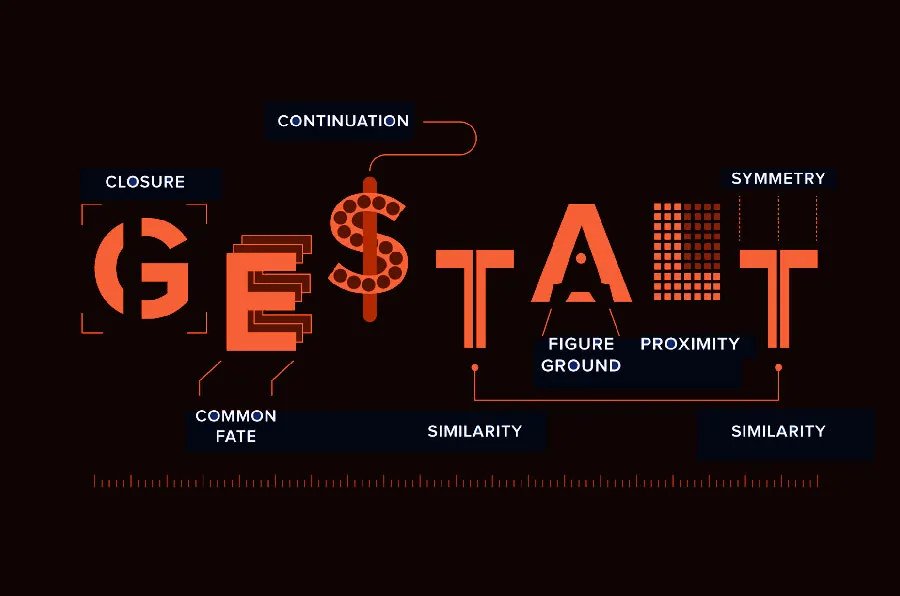
The 7 Core Gestalt Principles Applied to UI Design
1. Proximity
Proximity suggests that elements placed near each other are perceived as related. This principle is crucial when designing forms, buttons, or even navigation menus. By grouping related elements together, you help users naturally understand the connection between them.
Example: In a registration form, positioning the “Username” and “Password” fields next to each other intuitively signals their relationship, reducing cognitive load for the user.
2. Similarity
The principle of Similarity asserts that items that share similar characteristics—whether in shape, size, or color—are seen as belonging to the same group. By maintaining consistent design patterns, you guide users to understand that certain elements have the same function.
Example: Use the same color for all primary action buttons (like “Submit” and “Next”) to create visual consistency, signaling to users that they perform similar tasks.
3. Closure
The Closure principle refers to the mind’s ability to fill in gaps in incomplete shapes, allowing users to perceive a complete object or structure even when parts are missing. In UI design, this can be used to create subtle, yet effective, visual cues.
Example: A loading animation that’s a partial circle suggests motion and completion, even if the circle isn’t fully closed, engaging users without the need for a fully enclosed design.
4. Continuity
Continuity guides users’ eyes along a line or curve, creating a visual flow. This principle helps in directing users’ attention in a specific direction, making navigation smoother and more predictable.
Example: A navigation menu arranged horizontally or vertically follows a continuous flow, allowing users to easily follow the path from one menu item to the next.
5. Figure-Ground
The Figure-Ground principle involves distinguishing an object (the figure) from its background (the ground). It’s crucial in ensuring that important elements stand out, while less important components fade into the background.
Example: A call-to-action button with a contrasting color compared to its background ensures the user notices it immediately, making the interface more accessible and engaging.
6. Common Fate
The Common Fate principle explains how users perceive elements that move or change together as being related. By using this principle, you can group dynamic elements visually to improve user interaction.
Example: In a carousel of images, moving all images simultaneously (or having them change in sync) signals that they belong to a cohesive group, providing clarity about the nature of the interaction.
7. Symmetry and Order
Humans have a natural preference for symmetrical, balanced structures. The Symmetry and Order principle helps maintain harmony within the layout, making interfaces feel more organized and pleasant.
Example: A homepage layout with balanced text and images offers a sense of symmetry, improving readability and creating a visual sense of peace for the user.
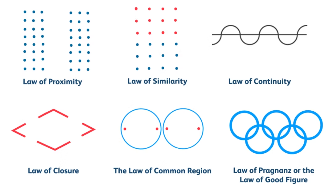
Why Gestalt Principles Are Essential in UI Design
1. Better Usability
By aligning your UI elements with Gestalt principles, you make it easier for users to navigate your interface. Proximity and similarity help users understand relationships between elements, reducing friction and improving usability.
2. Enhanced User Engagement
When your interface feels intuitive and cohesive, users are more likely to stay engaged. By applying these principles, you guide users through the design seamlessly, preventing confusion and promoting a positive experience.
3. Visual Harmony
Gestalt principles enhance the aesthetic appeal of your design by creating a visual balance between different elements. This harmony is crucial for crafting interfaces that feel polished and thoughtful.
4. Improved Communication
Gestalt principles simplify the communication of information by organizing it in a way that aligns with natural human perception. This ensures that users can process content effortlessly, improving their overall interaction with your platform.
How to Implement Gestalt Principles in Your UI Designs
Now that we’ve explored the core principles, let’s discuss how you can apply them in your day-to-day design work:
- Proximity: Group related elements, like form fields or product features, to visually indicate their association. This reduces ambiguity and helps users interact with the UI intuitively.
- Similarity: Maintain consistency across your design by using similar colors, shapes, and fonts for related items. This will visually connect elements and make the interface easier to navigate.
- Closure: Use subtle design cues such as partial borders, gaps in shapes, or partial icons. The brain will naturally complete the missing parts, creating a cohesive perception for the user.
- Continuity: Organize content and elements in a linear fashion. Arrange menus, images, or action buttons in ways that guide the user’s eyes along the intended path of interaction.
- Figure-Ground: Create high contrast between interactive elements (like buttons or links) and the background to make them stand out. This draws users’ attention to key actions without overwhelming the screen.
- Common Fate: Implement synchronized animations for groups of elements, such as image sliders or dynamic content, to show that they are connected and part of the same interaction.
- Symmetry and Order: Achieve balance by ensuring that elements are evenly spaced and aligned. This creates a clean, orderly layout that users can easily follow.
Conclusion: Designing with Gestalt Principles for Intuitive UI
Gestalt principles provide a psychological foundation that helps designers craft user interfaces that are not only functional but also enjoyable to interact with. By applying proximity, similarity, closure, continuity, figure-ground, common fate, and symmetry, you can create UI designs that are intuitive, aesthetically balanced, and easy to navigate.
Whether you're building a website, mobile app, or software interface, understanding how users perceive and organize visual elements allows you to design interfaces that feel natural and engaging. The power of Gestalt principles lies in their ability to simplify complexity, guide users' attention, and create a seamless interaction flow—ultimately enhancing the overall user experience.
Master the art of crafting intuitive interfaces and unforgettable user experiences with our Advanced UI/UX Design Course. Gain hands-on skills, elevate your career, and create designs that leave a lasting impact.
Enroll now at Kaarwan and take your expertise to the next level!
FAQs
1. What are Gestalt principles in UI design?
They are psychological theories that explain how humans naturally perceive and organize visual elements, helping to create more intuitive UI layouts.
2. Why should I use Gestalt principles in UI design?
They improve usability, engagement, and visual harmony, making the interface easier to navigate and more aesthetically pleasing.
3. Can Gestalt principles be applied to mobile UI design?
Absolutely! These principles apply to both desktop and mobile designs, enhancing user experience across platforms.
4. How do proximity and similarity work together in UI design?
Proximity groups related elements together, while similarity ensures that visually similar elements are perceived as connected, aiding in intuitive design.
5. How can I use closure in icon design?
You can create partially enclosed shapes or icons, allowing users’ minds to fill in the gaps, which helps with fast recognition and engagement.