Understanding Pink in Architectural Color Psychology
Color plays a crucial role in shaping the atmosphere of architectural spaces, influencing emotions, behaviors, and perceptions. Among the many hues, pink stands out as a color that exudes warmth, playfulness, and elegance. From historic palaces to modern creative hubs, pink has left a lasting impact on architectural design worldwide. Let’s explore the psychology of pink in architecture and its influence on spatial experiences.
1. What Emotion Does Pink Evoke?
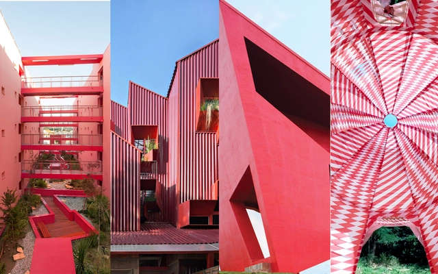
Pink is often associated with warmth, creativity, and compassion. It has a calming effect similar to blue but with a softer, more inviting touch. Depending on its shade, pink can evoke different feelings:
- Soft pastels create a sense of tranquility and innocence.
- Bold fuchsia and magenta bring vibrancy and energy to a space.
- Muted blush tones offer sophistication and elegance.
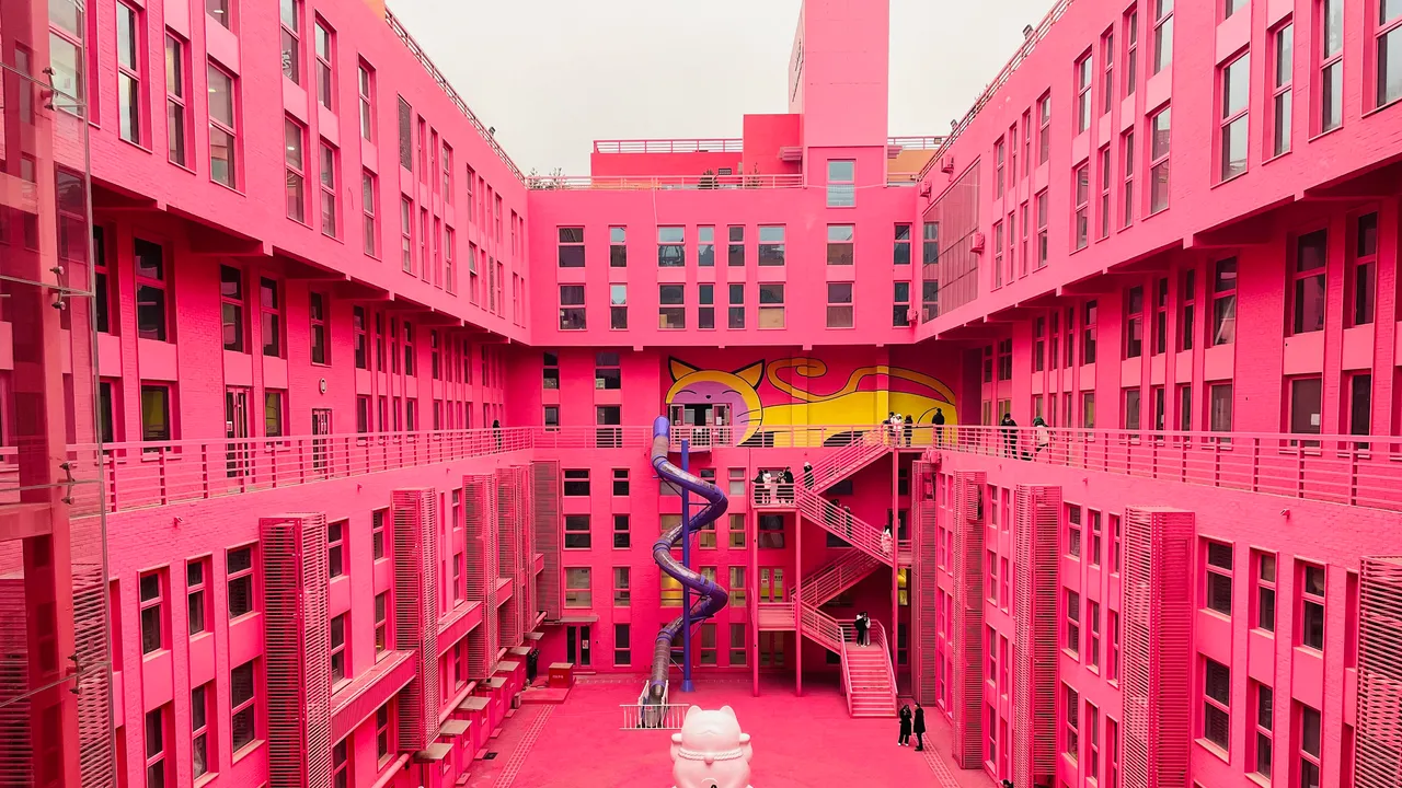
Psychologically, pink is known to reduce aggression and promote relaxation, making it a preferred choice for environments that encourage social interactions and comfort.
2. Traditional Uses of Pink in Architecture
Historically, pink has been a symbol of elegance, festivity, and cultural richness. Many palatial and heritage structures around the world have embraced pink hues to enhance their visual appeal.
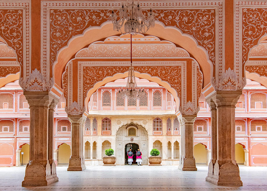
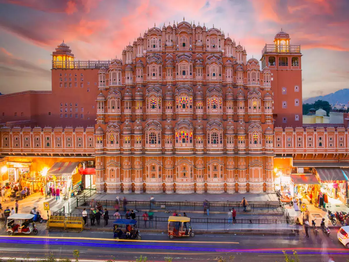
- India’s Jaipur, the ‘Pink City,’ is a prime example, where pink sandstone buildings were painted in a terracotta shade to welcome Prince Albert in 1876.
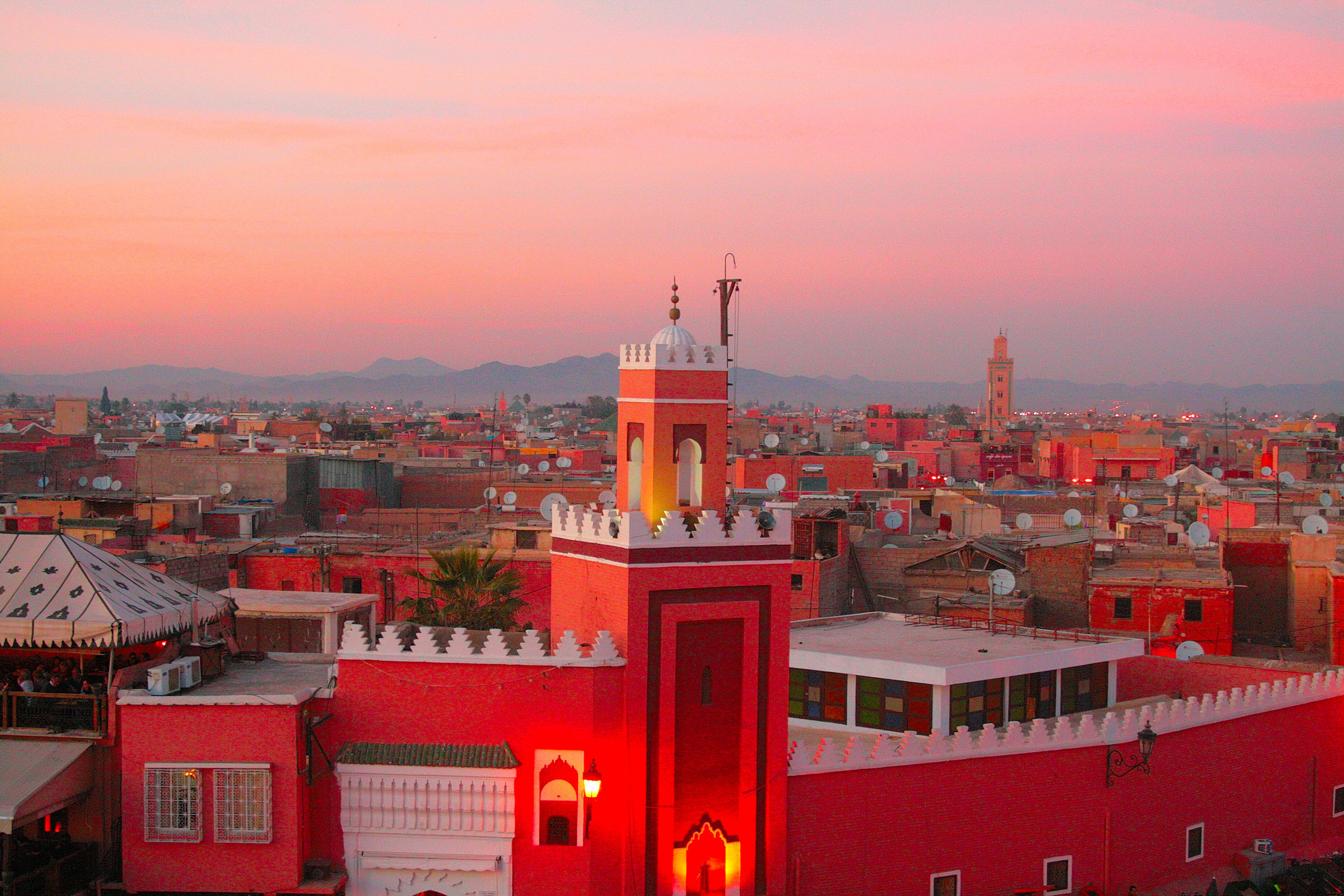
- Marrakech’s pink-hued architecture in Morocco reflects its desert landscape and historical significance.
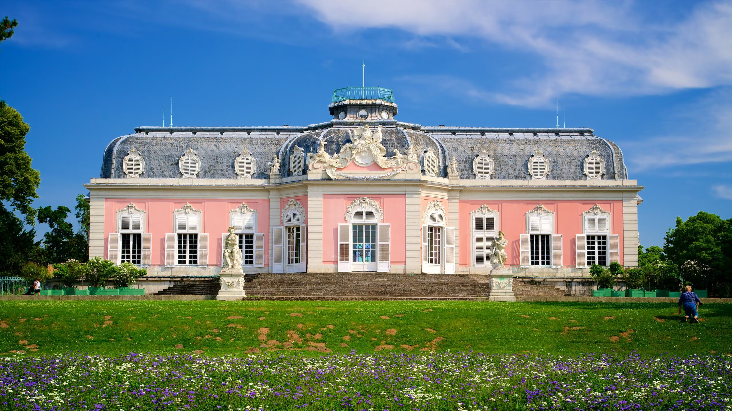
- European Rococo palaces, like the Schloss Benrath in Germany, often featured soft pink exteriors to symbolize luxury and charm.
3. Modern Applications of Pink in Architecture
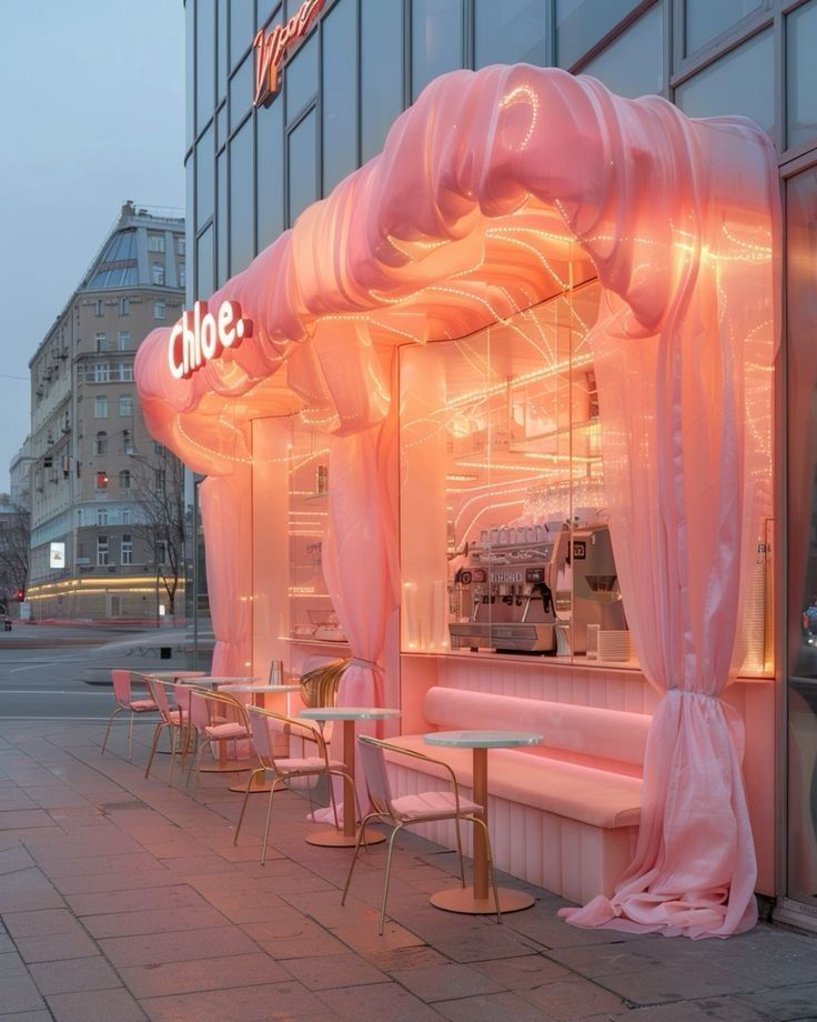
Today, pink is making a strong comeback in contemporary design, particularly in retail, hospitality, and creative spaces. It adds warmth and personality, making environments feel more engaging and dynamic.
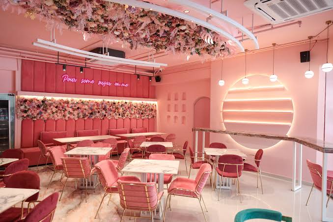
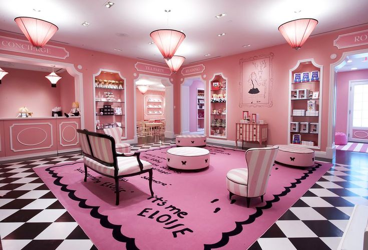
- Retail & Cafés: Many boutique stores and cafés use pink to create Instagram-worthy interiors that attract customers.
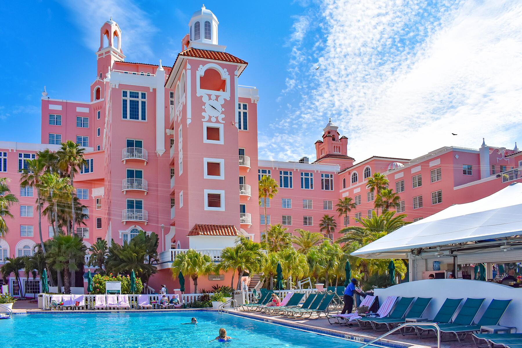
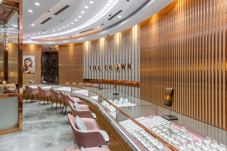
- Hospitality & Hotels: Shades of pink in hotels and resorts evoke a sense of luxury and relaxation.
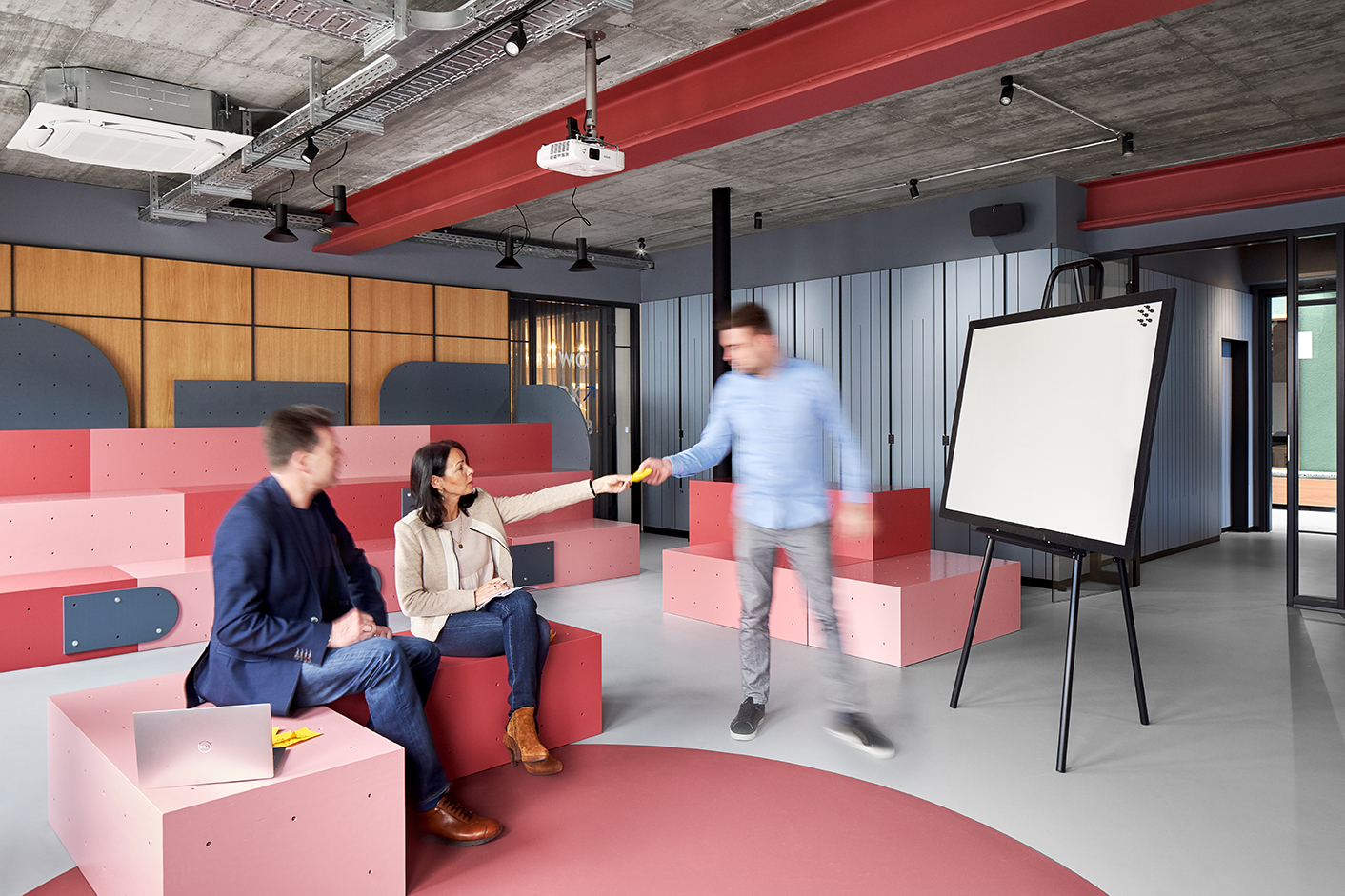
- Creative Workspaces: Offices and studios incorporate pink to foster innovation and a welcoming atmosphere.
4. What Other Colors Can Pink Be Paired With?
Pink is a versatile color that blends beautifully with various hues to create different moods:
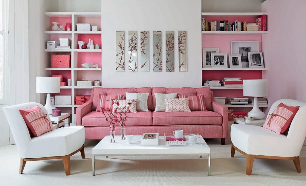
- Pink & White: A fresh, airy look perfect for minimalistic and elegant designs.
- Pink & Black: A striking contrast that adds depth and sophistication.
- Pink & Gold: Exudes luxury and warmth, often seen in high-end interiors.
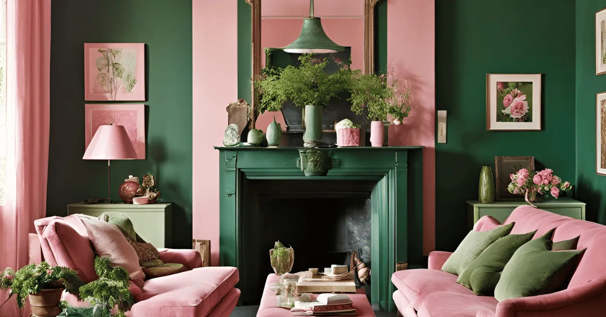
- Pink & Green: A nature-inspired combination that creates a balanced, earthy feel.
5. Pink Building Examples in India & Abroad
Pink has made its mark in architecture across the world. Here are some iconic structures:
India:
- Jaipur, Rajasthan – The Pink City’s heritage buildings, including Hawa Mahal, are world-famous for their terracotta pink facades.
Abroad:
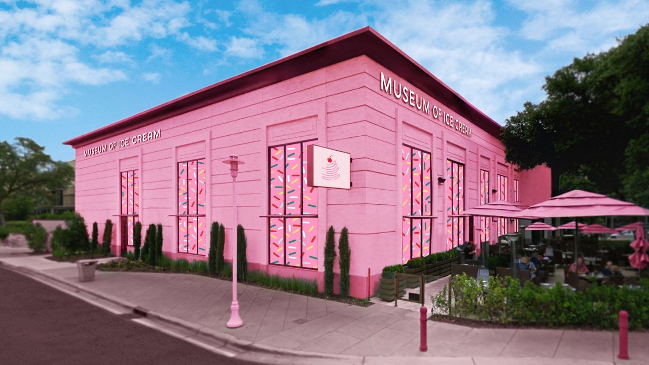
- The Museum of Ice Cream, USA – A modern space that fully embraces playful pink aesthetics.
6. Pros & Cons of Using Pink in Architecture
While pink offers several advantages in design, it also requires careful application to maintain balance.
Pros:
✅ Fosters creativity and warmth, making spaces feel inviting.
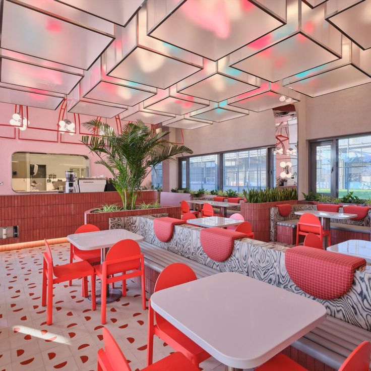
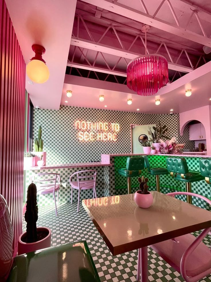
✅ Adds aesthetic uniqueness, helping structures stand out.
✅ Creates a soft, luxurious atmosphere in both traditional and modern designs.
Cons:
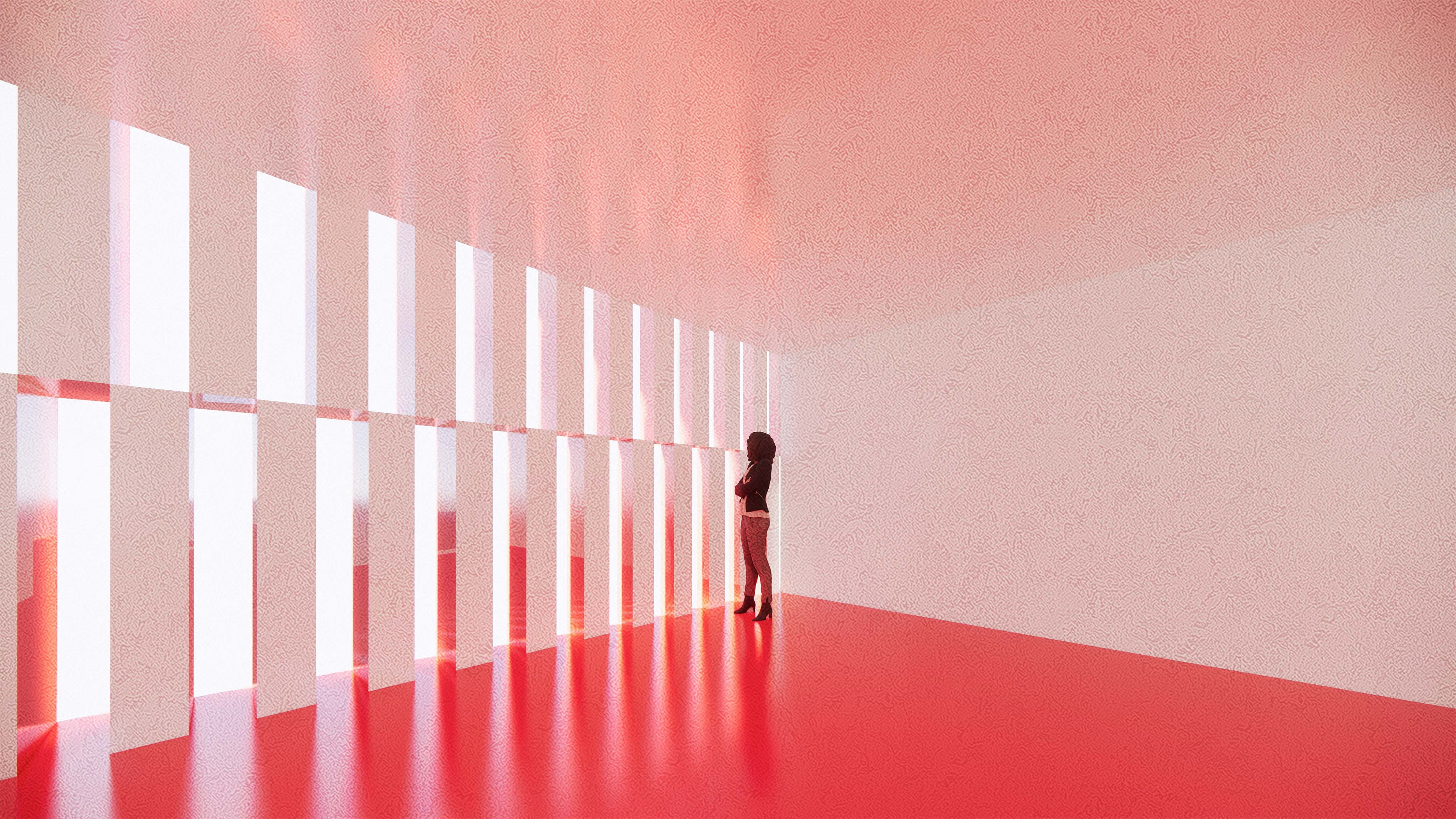
⚠ Overuse can feel overwhelming or overly delicate.
⚠ Bold pinks might not suit formal corporate environments.
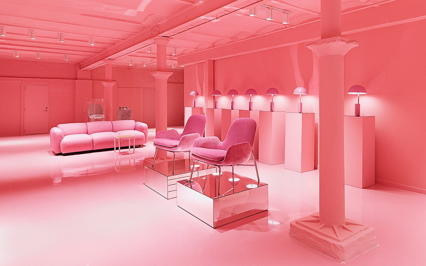
⚠ Can be associated with specific gender stereotypes if not applied thoughtfully.
Final Thoughts
Pink, when used wisely, can transform a space into a lively, sophisticated, or calming environment. Whether through historical elegance or modern vibrancy, this color continues to redefine architectural aesthetics across the globe.
Which color should we explore next? Let us know!
Interested in other color psychologies? Check out our articles on Blue Color Psychology, Orange Color Psychology, and Yellow Color Psychology.