Design Principles Every Architect Uses (But Never Talks About)
They’re rarely named, often instinctive — yet they quietly shape every good building.
Architects may debate styles, software, and signatures, but beneath all of that lies a shared set of unspoken design principles. These aren’t always taught formally, yet every experienced architect relies on them daily.
Once you learn to spot them, your designs instantly mature.
Hierarchy: Not Everything Deserves Attention
Good architecture guides the eye. Bad architecture shouts everywhere.
What architects do instinctively:
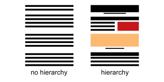
- One dominant form
- Secondary supporting elements
- Background spaces that stay quiet
Why it matters: Hierarchy brings clarity — in facades, plans, and even interiors.
Negative Space Is Design, Not Emptiness
Empty areas are often more powerful than filled ones.
Courtyards, setbacks, pauses in circulation — these spaces:

- Improve light and ventilation
- Reduce visual chaos
- Create breathing room
Architects rarely label this, but they constantly design around emptiness.
Alignment Creates Order Without Decoration
Things feel “right” when they line up — even when you can’t explain why.
Subtle alignments of:
- Windows
- Columns
- Furniture
- Grids
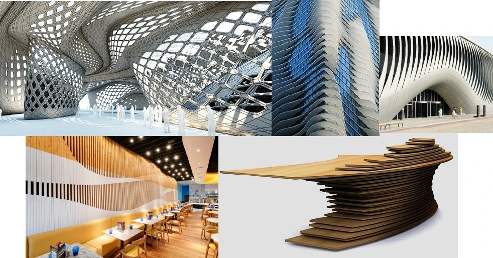
…create visual calm without adding a single ornament.
Repetition Builds Comfort
Repeating an element builds rhythm and familiarity.
Used in:

- Facade modules
- Structural bays
- Window proportions
Repetition reduces cognitive load — people understand spaces faster.
Contrast Makes Design Legible
Architects often introduce contrast quietly, not dramatically.
Examples:
- Heavy vs light
- Solid vs void
- Rough vs smooth
- Dark vs bright
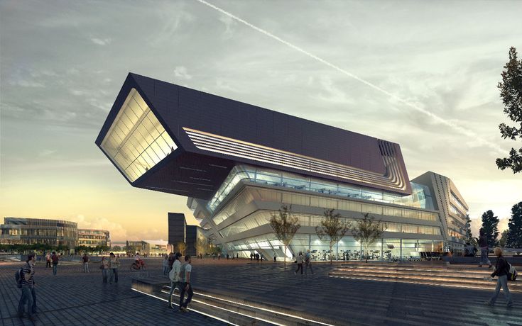
Without contrast, everything blends. With it, spaces gain identity.
Circulation Is the Real Plan
Experienced architects design movement first, rooms second.
They think about:

- How people enter
- Where they pause
- What they see while moving
- How spaces unfold
If circulation fails, no amount of form can save the building.
Scale Is Felt, Not Measured
Human comfort depends on proportion, not dimensions alone.
That’s why:

- A 3 m ceiling can feel oppressive or generous
- A wide corridor can feel narrow
Architects constantly adjust scale based on human perception, not drawings.
Light Is Treated Like a Material
Light isn’t added at the end — it’s shaped.
Architects think about:
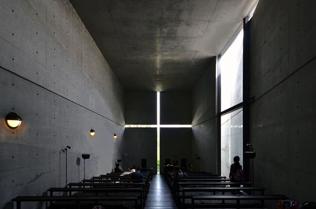
- Direction
- Intensity
- Reflection
- Shadow
Walls, floors, and openings are designed to control light, not just let it in.
Function Evolves — Flexibility Survives
Unspoken rule: buildings will be used differently than intended.
So architects subtly design for:
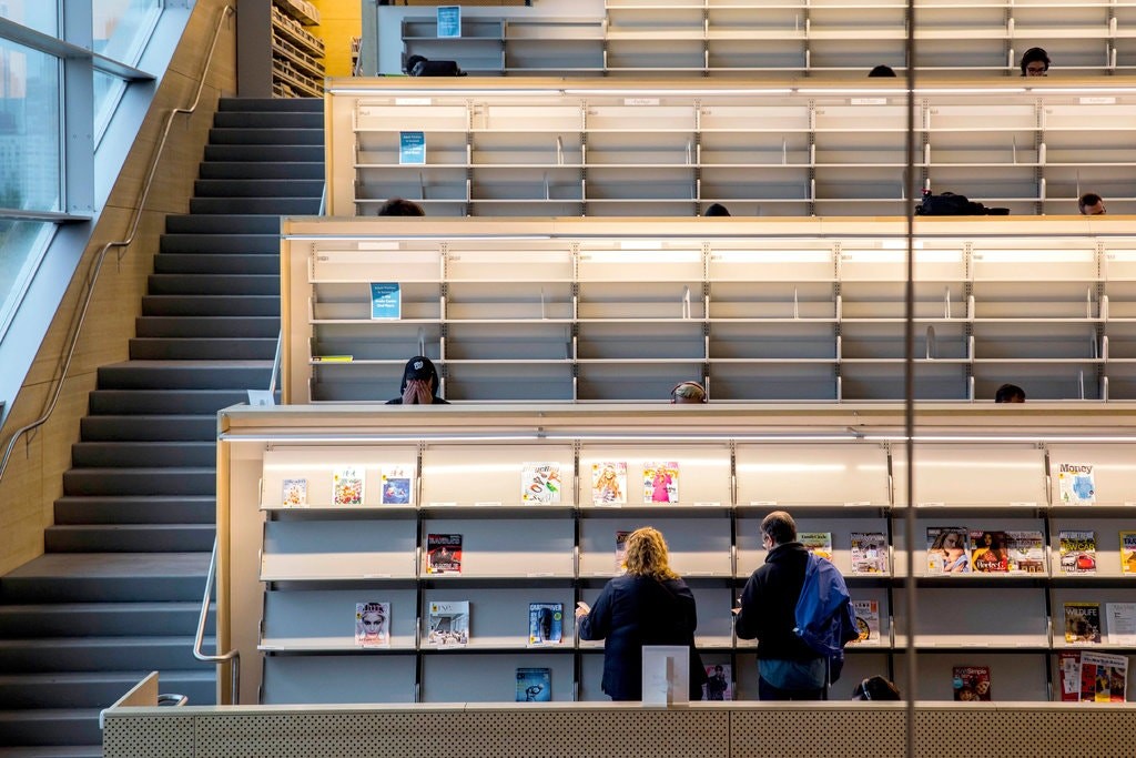
- Adaptable layouts
- Non-fixed furniture zones
- Expandable services
Rigid buildings age poorly. Flexible ones last.
Simplicity Is Often Harder Than Complexity
Clean designs usually involve more thinking, not less.
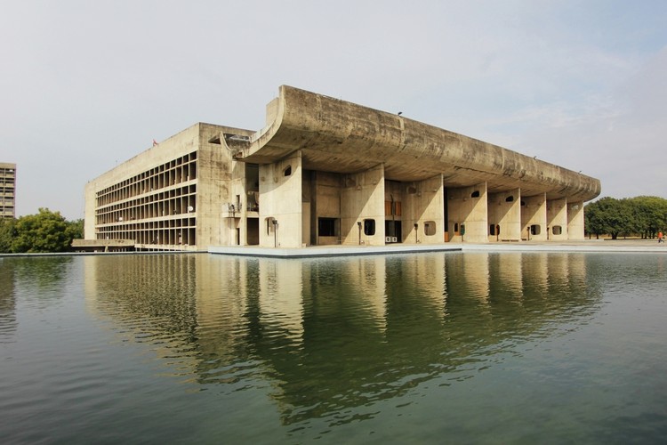
Every removed element requires confidence that the design still works.
Architects may not say it aloud — but restraint is a learned skill.
Quick Recap Table
| Principle | What It Does |
|---|---|
| Hierarchy | Creates visual clarity |
| Negative Space | Improves balance |
| Alignment | Adds order |
| Repetition | Builds rhythm |
| Contrast | Improves legibility |
| Circulation | Defines experience |
| Scale | Ensures comfort |
| Light | Shapes mood |
| Flexibility | Extends lifespan |
| Simplicity | Strengthens design |
Why This Matters for Students & Young Architects
These principles rarely appear as bullet points in college — yet interviewers, mentors, and senior architects immediately recognize when you’ve internalized them.
They’re what separate drawings that look good from spaces that work.
Learn These Principles Through Practice, Not Theory
Understanding design principles is one thing — applying them through drawings, detailing, and real workflows is another.
Kaarwan’s architecture programs focus on how design thinking translates into professional drawings and built outcomes, helping students and young architects bridge that gap.
👉 Explore Kaarwan’s courses to design with clarity and confidence.