

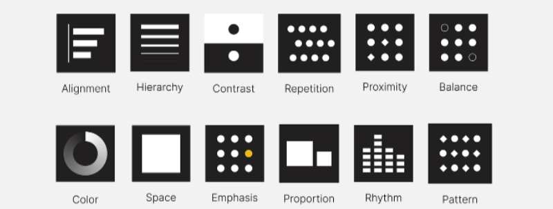
Design principles are the rules that guide how spaces and forms are organised. For architecture students, these principles become tools: they help you decide, justify, and explain your design decisions. Whether you’re preparing a sheet for studio or standing in a viva jury, being able to say “I’ve used rhythm in my fenestration” or “the hierarchy of this plan leads you to the atrium” instantly shows maturity in design thinking.
This guide explains 17 design principles in a simplified vocabulary for students, with examples to grasp better.
The 17 Design Principles in Architecture
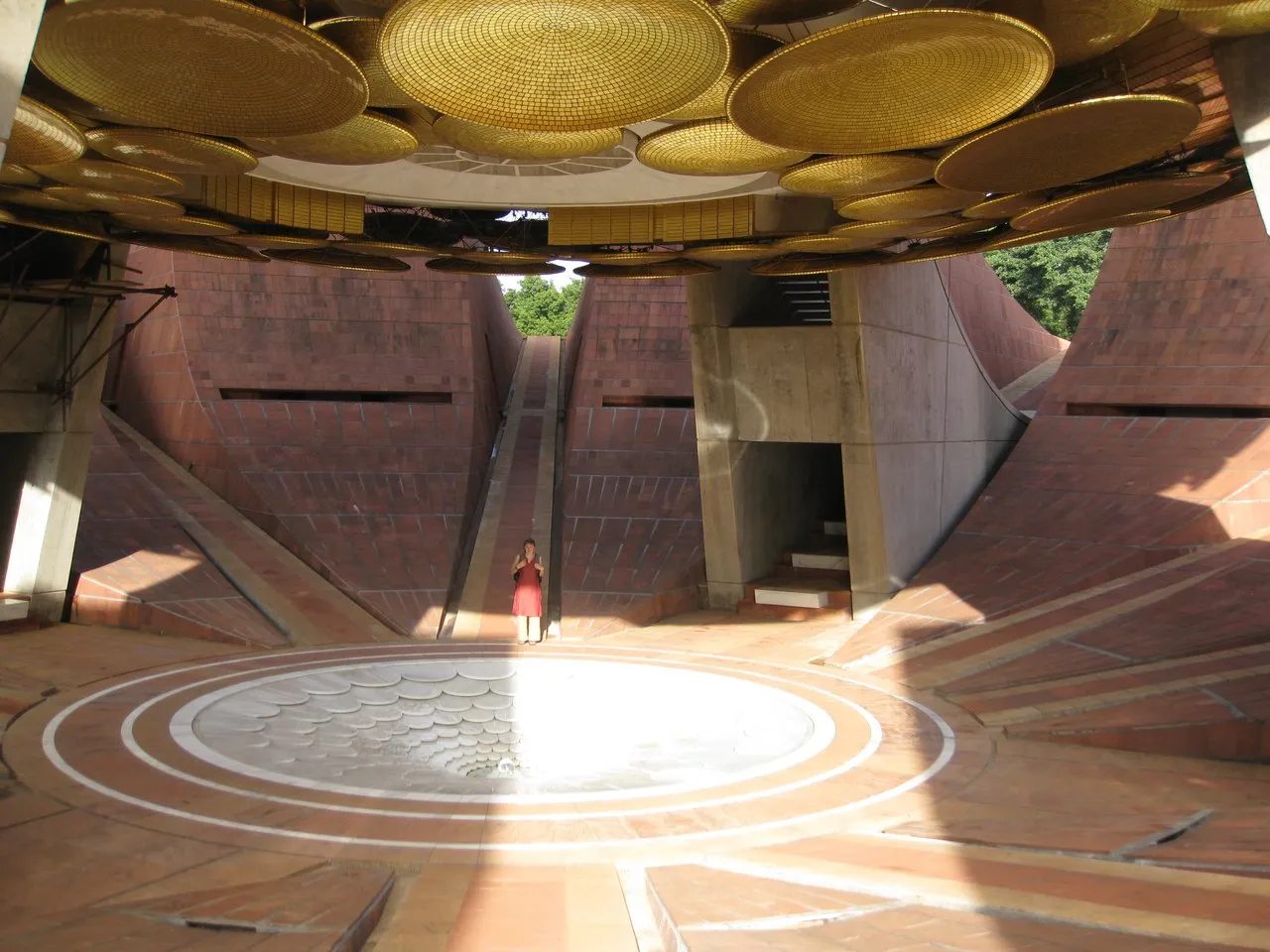
Image Source: Wordpress.com
1. Proportion
Definition: The relationship of sizes between different parts of a building or space.
At the Maitri Mandir in Auroville, proportion is not just about structural balance — it’s an emotional and spiritual tool. The golden sphere towers above you, creating a humbling scale. Proportion here draws your gaze upward, reminding you of something larger than yourself. Unlike some buildings where proportion emphasises power or grandeur, here it invites stillness, humility, and reflection.
Reflection: Have you been to such a place? Try journaling, experiencing standing under the Mandir’s dome, walking through its gardens, sitting in meditation halls, or meditative spots under the trees. How did the proportions of space - height, width, volume - change your sense of self? Where did you feel the most connected to the divine? What added to your experience? Did you think the grandeur could convince you what the project was built for? Or did you read something else, of your own, about the society there? Feel free to think, document and observe!
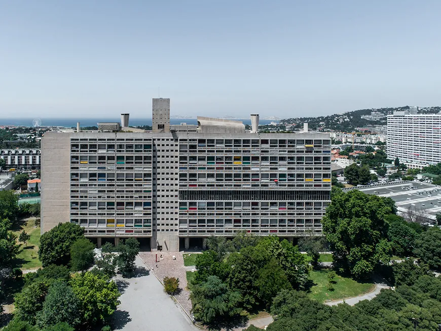
Image Source: ArchEyes
2. Scale
Definition: The size of an element in relation to human dimensions or the surrounding context.
Le Corbusier was commissioned to design the Unité d’Habitation during a period of unprecedented housing crisis in Europe following World War II. The project eventually housed nearly 1,600 residents, and scale played a crucial role in its design.
At the neighbourhood level, the block was much larger than anything around it. Nicknamed the vertical garden city, it incorporated amenities like medical shops, a rooftop pool, sports facilities, and even a hotel — all within one building.
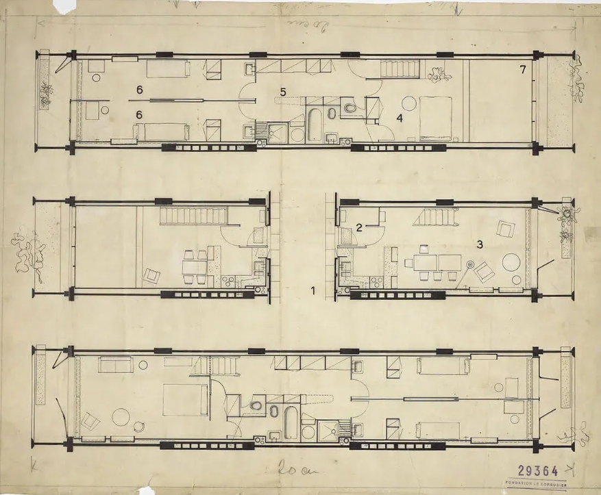
At the human scale, Le Corbusier worked with his Modulor system to ensure that families had light, space, and order inside their homes. Units were narrow, but the living rooms were given double-height spaces, creating a sense of breathability and comfort. The varied fenestrations, spacious corridors, and careful proportions made life within this compact structure both dignified and functional.
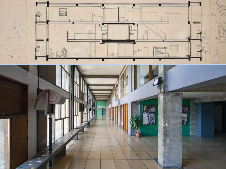
Image Source: ArchDaily, Corridors in the Building Unité d’Habitation
One of the most innovative aspects was the corridor system. Instead of placing a double-loaded corridor on every floor, Le Corbusier designed interlocking duplex apartments that spanned across the building’s depth. This meant corridors were required only every third floor. The result was a building that scaled circulation more efficiently, reduced wasted space, and gave each unit cross-ventilation and access to natural light. Scale here wasn’t just about size, but about optimising space for human comfort after a crisis.
The Unité became not just housing, but a self-sufficient community contained within a single built volume. It was called to be city inside a city, getting the structure name of Vertical Garden.
Reflection: Sometimes, architects use scale to make their structures iconic, depict power or affluence, but here, in the aftermath of war, scale was used to prioritise human comfort in difficult circumstances. On the next visit to a tall building or housing complex, one can observe the building, take notes, and read the planner's ideology to see what else there is to figure out.
“Space and light and order. Those are the things that men need just as much as they need bread or a place to sleep.”
– Le Corbusier
_1759144615364.jpg)
Image Source: Get Explore
3. Balance
Definition: Balance is the distribution of visual weight in architecture. It can be symmetrical, where both sides of a composition mirror each other, or asymmetrical, where harmony is achieved through contrast and careful placement of different elements.
The Taj Mahal in Agra is the epitome of symmetrical balance. Its central dome, minarets, arches, and reflecting pools all align along a perfect axis. But balance here is not just visual — it’s technical. The size of the domes, the weight of the pedestal, the scale of the minarets, and even the gardens had to be measured and executed with extraordinary accuracy. Achieving such symmetry at a monumental scale was not just a design choice but a feat of engineering precision.
Reflection: Think about balance beyond aesthetics; here, it's about how construction supports design. Next time you’re sketching a symmetrical plan, ask yourself: if this were built, would the scale and weight of every element still “balance” structurally? Or when drafting your own plans, don’t think of balance only in terms of façades. Look at how corridors, rooms, courtyards, or voids are distributed on the sheet. Is the balance created by symmetry, or by contrast? And how does that choice make you feel within the space? You can observe spaces around you for the same!
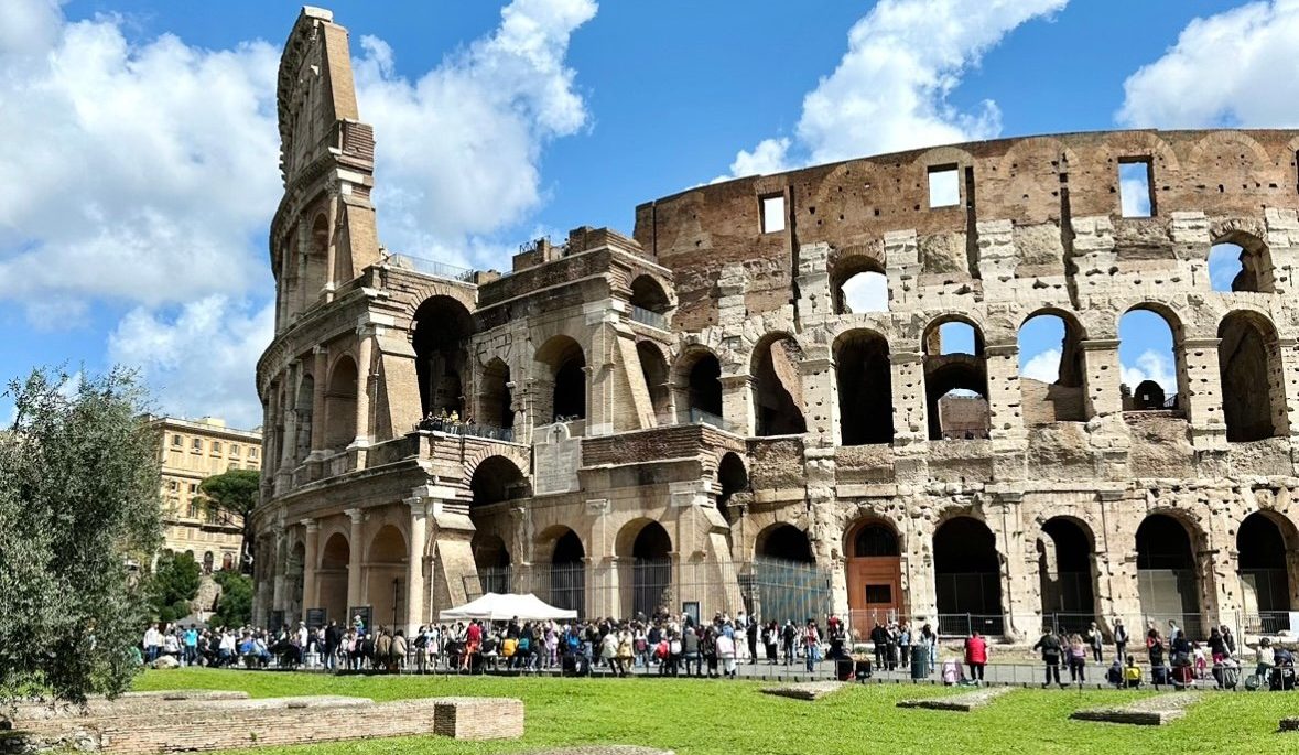
Image Source:
4. Rhythm
Definition: Rhythm in architecture is the repetition of elements — like columns, windows, arches, or beams — that create a sense of flow and order. It sets up a pattern the eye follows, establishing movement and continuity in a building.
The Colosseum in Rome's façade is composed of repetitive arches stacked in tiers. As you walk around, your eyes instinctively follow the arches, anticipating the next and turning with the curve of the structure. The rhythm is not just in the repetition of arches, but the material arches are built with and their constant depth. Thus, creating a sense of harmony and grandeur. The Colosseum continues to awe us, depicting perfection with Roman engineering genius.
Reflection: Rhythm is not only about beauty but also predictability — the comfort of knowing what comes next. Think of how you feel when walking through a colonnade, or even past streetlights aligned in sequence. Next time you draw a façade, experiment with alternating patterns — rhythm doesn’t have to mean monotony, it can be varied like a piece of music.
_1759143664026.jpg)
5. Emphasis
Definition: Drawing attention to a focal element through contrast, size, or form.
Example: Fallingwater, Pennsylvania — cantilevered terraces dominate, emphasising horizontality. In the forest over a waterfall, the house appears unexpectedly. Its stone walls blend with the mountains, while the smooth, lime-plastered surfaces are as harmonious as the flowing water and lush greenery. Yet, applied over wide, horizontally spanned terraces and deep balconies, they stand out subtly, drawing attention without disrupting the landscape. Emphasis here is not about overpowering the landscape — it is about highlighting certain elements while staying in harmony with the surroundings.
Reflection: Notice the surroundings around you in everyday life, whether it be on television, social media, or a walk around your neighbourhood. Where all emphasis is drawn to attract and sell you things, and where all it is, not loud, but standing harmoniously? Do you want to capture pictures of it in your journal to deepen your understanding of design principles and drawing reference later?

Image Source: Britannica
6. Contrast
Definition: Juxtaposition of opposites (light/dark, solid/void, old/new).
Example: Louvre Pyramid, Paris — glass pyramid contrasts the historic stone palace.
Reflection: The buildings are part of the Louvre complex, and nearby have a culturally rich context. Heritage building elements and details, not visible in the current-day context. Today's built structures are made of concrete, steel, and glass. The Louvre Pyramid although it stands as a futuristic icon and statement. Imagine what generations beyond us would think of this space? Something intelligent, something mysterious, perception of higher intelligence, sort of. Or for the current generation or citizens, it takes them to a future which wasn't here a few years back when this icon got built. However, it is equally attention-seeking, actually competing against the heritage structures around it. The glass is an absolute contrast, era-wise. Stone, Lime, Detail of elements on wood, wall, etc, to plain transparency of a glass!
From finding strength in hiding behind protective stone walls, in knowing strength, so as buildings made of glass almost echoing, we are unafraid!
Though one thing is complementory, both the heritage has to speak of glamour from it era, and the pyramid also has a message to convey - deep or shallow, artistic or vague, it does say something atleast shocks.
Then, in the heritage buildings in the Louvre Complex, there are many details: artification on doors, windows, plaster, walls, knobs, etc. But the same amound of details are as if covered in the Louvre Pyramid.
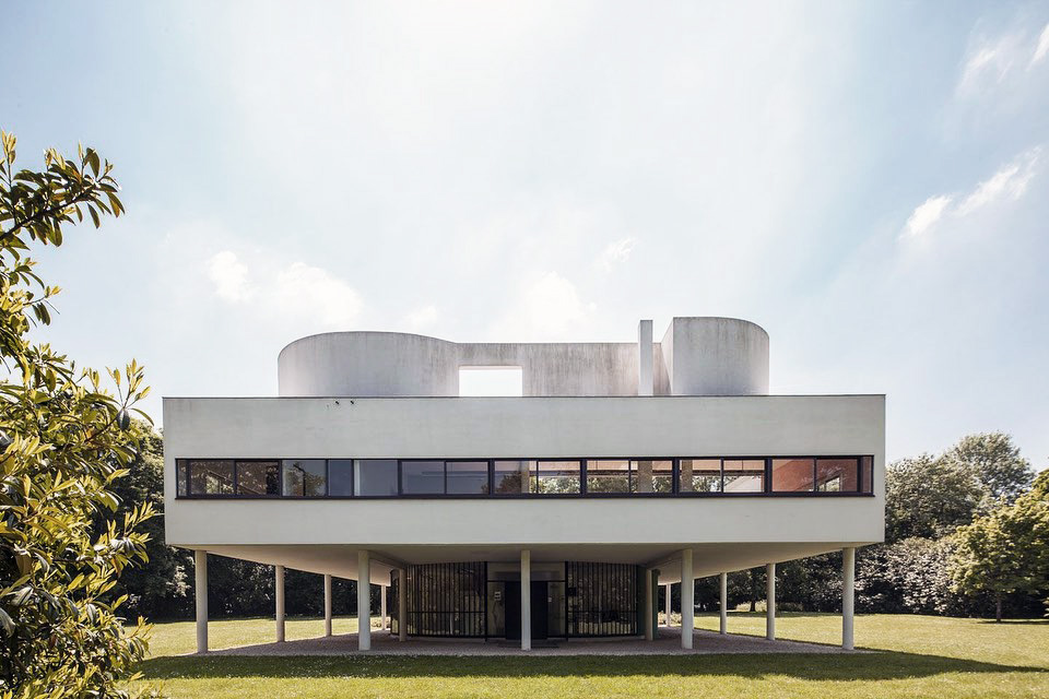
Image Source: ArchEyes
7. Unity
Definition: A feeling of wholeness and belongingness achieved when every part of a design aligns towards a singular purpose: visually, functionally, spatially or emotionally.
Example: Villa Savoye, France — the pilotis, free planning, ribbon windows and accessible roof garden all read as one continuous architectural language. No gesture feels accidental.
Reflection: Unity is not about making everything look the same — but ensuring everything feels like it came from the same thinking. In Villa Savoye, each element is not trying to overpower the other. The material palette stays humble. The geometry stays relaxed yet intentional. Lines speak in continuity. The architecture does not try to impress with ornament or pastiche, but instead expresses clarity — a clear mind, translated into built form.
Unity in architecture makes a user experience the building without interruption. The transitions are almost invisible — from exterior to inside, from structural logic to spatial experience, from programme to circulation.
Unity therefore is not about shouting identity — it is about holding integrity.
Student cue: Keep materials, line weights and visual language or something - intentfully consistent. A concept can naturally form like it, or as per the brief cues you might have to allow a space/building to speak one dialect. The moment architectural elements begin to belong to each other, the space becomes calmer, and the user becomes more receptive to the narrative of the design.
_1759140909750.jpg)
Image Source: Archdaily,Inclusice Education Centre, Enrico Molteni Architecture
8. Harmony
Definition: A pleasant arrangement where elements complement one another, creating a visually calm and cohesive spatial experience.
Example: A creative space/playroom to hang out (probably for kids, but honestly, adults need the sort of harmony displayed here too, in the image above. ;)
Reflection: In this space, harmony is not accidental — it is quietly orchestrated. The light timber columns, ceiling grid and structural members instantly establish a soft and warm identity. The repetition of wooden beams above naturally anchors the eye towards order. The muted pastel furniture, the curved forms of seating elements, the circular carpet and the subtle yellow accents on storage units all support this gentle atmosphere — nothing is fighting for attention, yet everything is contributing.
The space is clearly designed for children, yet it does not infantilise the architecture. Instead, it uses materiality and soft geometry to make the scale feel approachable, playful and emotionally safe. Harmony here is achieved by restraint — limiting materials, limiting colour noise, allowing natural light to diffuse evenly from above, and avoiding visual clutter. All pieces are performing their roles without wanting to dominate the narrative.
This is the kind of harmony that allows the user to breathe and simply be in the space.
Student cue: Use restrained material palettes, reduce unnecessary visual noise, and allow form, colour and circulation to sit peacefully together (or complement each other). When nothing feels forced, harmony becomes effortless.
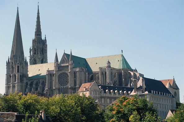
Image Source: Sacred Land
9. Hierarchy
Definition: The organisation of elements, spaces or forms in order of their importance — visually, structurally or functionally.
Example: Chartres Cathedral, France — the central nave rises significantly taller, more illuminated and more ornamented than the side aisles, instantly communicating its primacy and liturgical importance.
Reflection: Hierarchy is what tells us where to look first, before any text or signage even appears. In Gothic cathedrals like Chartres, hierarchy is deeply spatial — the soaring nave draws the eye upwards almost involuntarily. The spires, one more ornate than the other, are also speaking hierarchy externally — creating anticipation even before entry. Ornament, proportion, structure, circulation, verticality — all of it has been choreographed so that the divine realm feels higher, further, almost just out of reach.
The visitor does not need architectural theory to understand which part of the building holds the highest significance — their body already reads it through space. Hierarchy makes meaning legible.
In contemporary architectural practice, hierarchy still functions — but often becomes more subtle. It could be through light, through axial alignment, through material emphasis on certain thresholds, or even through scale contrast between private and public zones.
Hierarchy is therefore far more than “bigger room = more important” — it is a psychological cue, quietly guiding behaviour, respect, reverence or simply direction.
Student cue: Before drafting, decide which spaces must hold priority — then allow geometry, axis, height, proportion and light to reinforce that decision. Leading the user intuitively — that is, hierarchy.
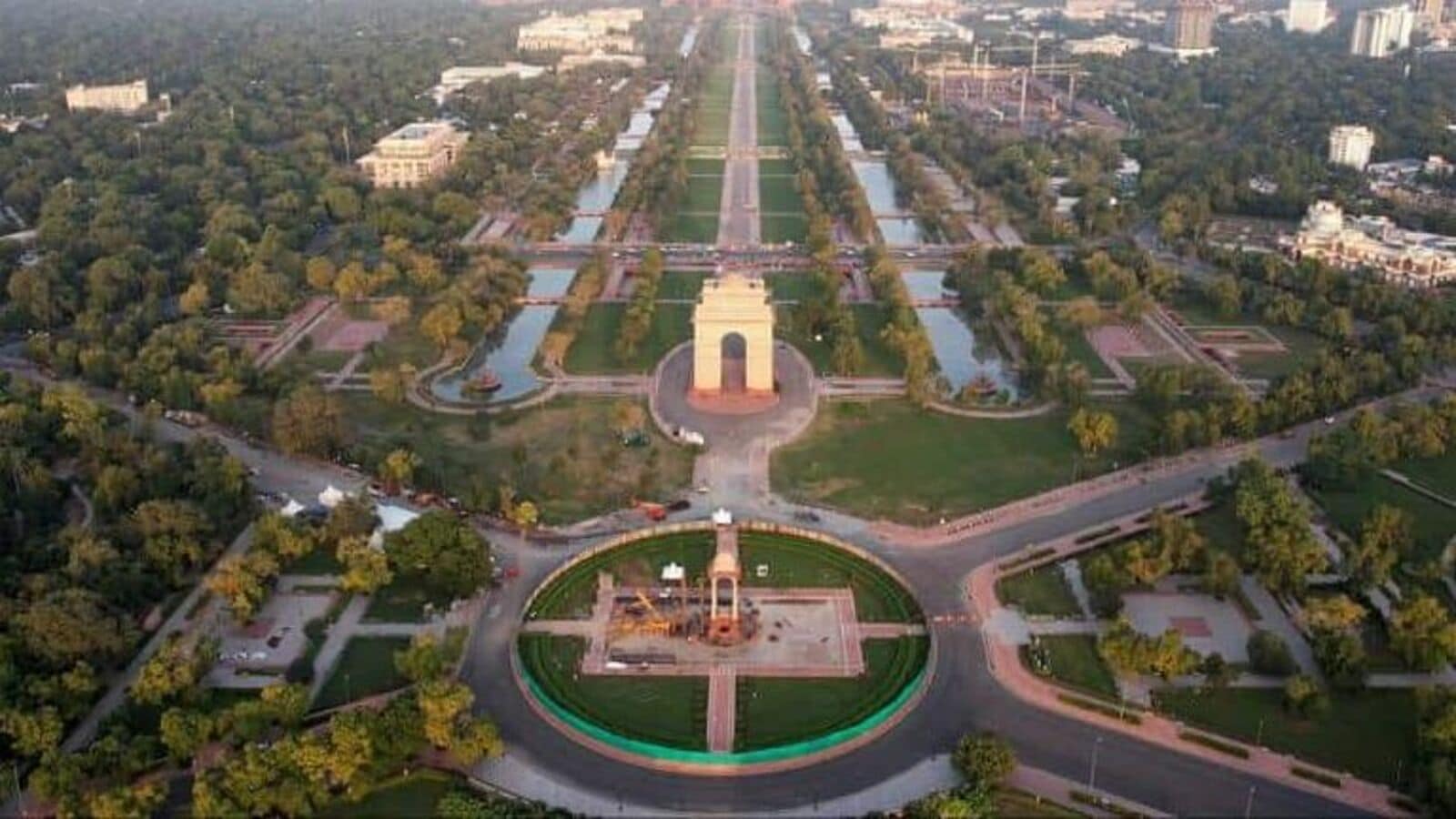
Image Source: Hindustan Times
10. Axis
Definition: An imaginary line used to align, organise and give direction to forms, spaces and movement.
Example: Rajpath, New Delhi — a powerful axial gesture that aligns India Gate with Rashtrapati Bhavan, creating a ceremonial spine through the city’s power centre.
Reflection: Axes are not just drafting tools — they govern how humans perceive order. An axis can direct procession, create anticipation, frame a view, or even establish hierarchy without the user consciously recognising it. Along Rajpath, the sense of state authority is spatially communicated not through height or complexity, but through linear clarity. The axis brings calmness, rhythm and purpose to the experience of moving through the capital.
In architectural planning, axes can be singular and dominant, or layered and subtle — shifting between interior and exterior, public to private, framed view to framed void. Even within small-scale projects, a quiet axis brings coherence. A single door aligned to a tree outside can create a meaningful narrative. A courtyard aligned to a water body can become memory.
In deeply historic cities, axes have held symbolic power — connecting the sacred, framing the divine, or linking the everyday with the state. In modern practice, the axis continues to work silently, binding orientation and clarity into the built form.
Student cue: When studying a site, lightly sketch potential visual lines of force — axis lines often already exist in landscape and context. Your design simply needs to recognise them, align to them, or respond intentionally by breaking them.

Image Source: Kevin Standage
11. Symmetry
Definition: The mirroring of elements across a central line — visually balancing forms, masses, geometry and composition.
Example: Humayun’s Tomb, Delhi — an iconic Mughal garden tomb perfectly symmetrical in plan and elevation. One can identify several supporting principles within the same example, too: axis, repetition, harmony — all working cohesively.
Reflection: Symmetry gives a silence and stillness to architecture — almost a meditative quality. When a building is symmetrical, the eye finds ease. The mind stops questioning. Everything feels intentional, measured, timeless. In structures like Humayun’s Tomb, symmetry is not decorative — it is philosophical. It communicates balance between worlds, between earth and sky, between physicality and transcendence.
Even in contemporary practice, symmetry can stabilise a composition. It offers clarity. It reduces confusion. It allows the user to intuitively understand orientation without additional visual cues. However, perfect symmetry is not always necessary — sometimes near-symmetry or balanced asymmetry can also work, especially when designing dynamic programmes.
But when a designer chooses symmetry, there is a powerful message being sent: dignity, equilibrium, and confidence.
Student cue: Use mirror commands and reference lines in CAD consciously. Symmetry should help the user navigate space intuitively — not just become a stylistic preference.
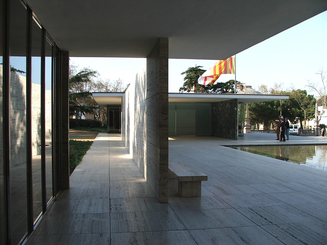
Image Source: Architectures/Models
12. Datum
Definition: A reference line, plane or volume that anchors the composition — against which all other elements are organised or measured.
Example: Barcelona Pavilion, Spain — the calm and precise datum of the plinth establishes a grounded horizontal line, while the walls above seem to float effortlessly, creating a measured relationship between solidity and lightness.
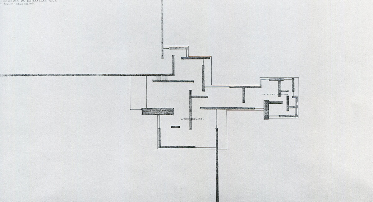
Image Source: Architectures/Models
Reflection: A datum is like the quiet control line in architecture — subtle, but powerful. It organises space without drawing attention to itself. Much like a horizon line in nature, the datum stabilises visual judgement. In the Barcelona Pavilion, nothing feels random or misplaced because the datum is holding the entire composition still. It gives clarity to what is fixed and what is allowed to glide.
In buildings, datum lines can exist through floor levels, continuous façade bands, rooflines, railing heights, or landscape terraces. Even when a building becomes spatially complex — the datum keeps it readable. Without datum, a project can quickly feel visually disordered — even if individual forms are beautiful.
Datums, therefore, help a designer establish a visual rhythm early in the concept stage. Once that line or plane is set, everything finds its rightful relationship.
Student cue: Mark plinths, floor levels and roof reference lines clearly in your drawings. Datum lines are guides — not restrictions — but they will anchor your entire spatial logic.
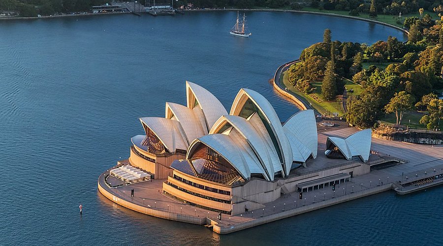
Image Source:
13. Transformation
Definition: Altering a form while retaining the original conceptual essence that the form was born from.
Example: Sydney Opera House — pure spherical geometry transformed through sectional manipulation, refined into expressive shell roof structures.
Reflection: Transformation in architecture is not a random distortion of shape. It is an intentional evolution. The idea remains — the expression shifts. The starting geometry is honoured, not abandoned — it matures. In the Opera House, the geometry remains mathematically rooted, yet what emerges feels organic, sculptural and performative.
In the image here, although the openings follow a rhythmic repetition, the perspective adds a subtle transformation of scale — from the last structure in the background, gradually leading towards the building in the foreground. This visual shift hints at how transformation can also be perceived through sequence, distance and spatial experience — not only through the direct evolution of a singular form. Repetition then becomes a medium through which transformation is revealed: by the way our eye reads scale progression.
Good transformation therefore holds clarity — it carries its original DNA, but allows discovery.
Student cue: Always share form iterations in your sheets — primitive → manipulated → final. It communicates thought, not just output.
_1759130771396.jpg)
Image Source: ArchDaily
14. Repetition
Definition: The reuse of an element — form, colour, detail, material, rhythm — to create unity, continuity and coherence within a composition.
Example: Salk Institute, La Jolla — the repeated laboratory blocks on either side create a poised courtyard between them. The rhythm of openings, structure and massing builds a meditative spatial order.
Reflection: Repetition can be extremely powerful when done consciously. It is the principle that allows the mind to relax — because the visual language becomes predictable, familiar and therefore trustworthy. The Salk Institute does not rely on ornament to impress — it relies on repetition to communicate order, direction and intent. The blocks, though identical, do not feel monotonous. Instead, repetition becomes a poetic device — framing the horizon, framing the sky, framing the human scale.
In many cultural architectural contexts — especially classical temple complexes, cloisters, arcades and even vernacular housing rows — repetition is what allows spaces to belong to a collective identity. It also allows users to intuitively measure scale and pace movement. Repetition becomes a spatial rhythm.
But repetition must be balanced. If everything repeats without variation, dullness can occur. Architecture succeeds when repetition is purposeful — clarified through alignment, scale, spacing or pattern logic.
Student cue: In elevations and drawings, use consistent fenestration symbols, consistent mullion patterns and consistent grid discipline. Even small repetitive gestures can help the building feel composed and stable.
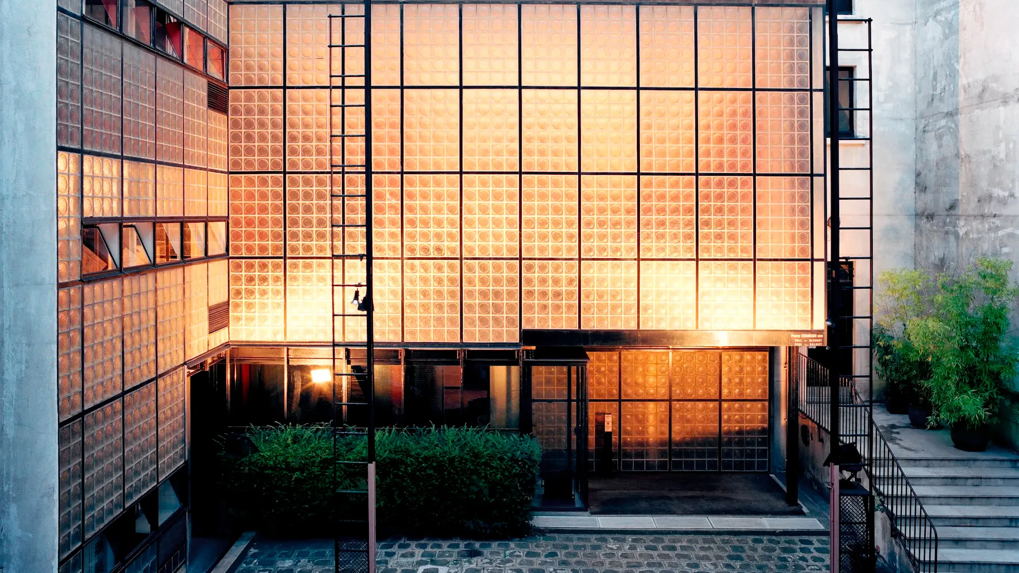
Image Source:
15. Transparency
Definition: When boundaries between spaces become visually lighter, layered or visually penetrable — either through literal transparency (glass, perforations) or implied transparency (framing, axial views, long sightlines).
Example: Maison de Verre, Paris — glass block walls soften division between inside and outside without losing privacy.
Reflection: Transparency allows architecture to breathe. In the example shown from Modo Designs, glass façades and perforated planes dissolve the hard separation between interior and exterior. The observer can see through layers — material, light, shadow and nature. Transparency becomes a spatial conversation — what is revealed, what is partially hidden, and what remains implied.
It allows light to travel through space, but also allows space to visually overlap. Transparency reduces the weight of built mass and invites a gentler relationship with the climate. In contemporary Indian practice, transparency becomes crucial for comfort, cross-ventilation, and emotional openness — especially in dense urban living where small visual breaks can change how a space is experienced.
Student cue: Use lighter line weights, dashed line types and subtle poche reductions in drawings to communicate areas intended to remain visually permeable.
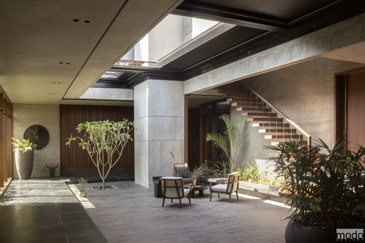
Image Source: Modo Designs
16. Space and Void
Definition: The emptiness between forms holds equal, if not greater, architectural value than the forms themselves. Void is a design tool.
Example: Traditional courtyard houses of Ahmedabad — the central open-to-sky void organises circulation, light, microclimate and social interaction around it.
Reflection: Architecture is not only made by walls, but also by the spaces between them. The image shown here of sustainable facades reminds us that voids — gaps, cut-outs, openings — are as critical as built surfaces. The void frames sky, motion, airflow, pause, silence. In dense cities, the void becomes luxury. In climate-responsive design, the void becomes performance.
The biggest misunderstanding students have is thinking architecture is drawing walls. Architecture is orchestrating relationships — and void is often the quiet protagonist.
If built mass is the body, void is the breath.
Student cue: Hatch built surfaces in drawings distinctly, and left the void intentionally clear. It helps train the mind to value emptiness as design, not a leftover.
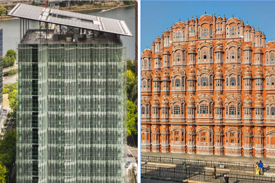
Image Source: Glumac and Britannica
17. Context
Definition: Designing with sensitivity to the cultural, climatic, topographical, environmental and social conditions of the site.
Example: Edith Green-Wyatt Federal Building, Portland and Hawa Mahal, Jaipur — both embrace sustainable façade logics suited to their climates. One achieves shading through adaptive fins and high-performance assemblies; the other through perforated jharokhas that modulate heat, air and light in a hot desert environment.
Reflection: Context is not a constraint. It is a direction. When an architect listens to context, the building begins to belong — not just sit. Sustainable facades across the world differ because climate narratives differ. Context reminds us that architecture cannot be copied–pasted. Every site already has intelligence — in its materials, in its past, in its people, in its weather. Architecture must respond, not overpower.
The future of practice is not universal buildings shipped everywhere — but contextually literate buildings grown from site logic.
Student cue: Begin every concept with a site reading — measure sun, wind, material culture, social patterns, mobility, vegetation, history. Let context become your first design collaborator.
Tips Students Might Like to Apply in their Assignments
- Once you understand the principles rather than memorising them, you can further apply them in a good sketch, or even a design project, subconsciously, making it impactful
- Sketch case study specific elements (arches, windows, façades) to stand out as quick references. Because it reflects your understanding of the topic.
- Always link principles to use: e.g., “rhythm in fenestration” or “hierarchy in plan.”
- Combine carefully - a project can utilise multiple principles, but clarity in your presentation/picture/sketch is paramount.
Final Thoughts
The 17 design principles are not rules to restrict creativity; they are tools to structure your vague visions into something that has impact. It demonstrates a clear understanding of principles for a designer just starting out! From the arches of the Colosseum to the glass transparency of modernist houses, each principle has shaped architecture for centuries. For students, knowing these principles — and being able to explain them through case studies — makes sheet drafting sharper and helps your professors assess your understanding of topics, which often makes it easier on your grades, mostly.
When used well, design principles transform drawings from flat lines into impact drive built world.
FAQs
Q1. What are the 17 principles of design in architecture?
They include proportion, scale, balance, rhythm, emphasis, contrast, unity, harmony, hierarchy, axis, symmetry, datum, transformation, repetition, transparency, space & void, and context.
Q2. Why are they important for students?
They give structure and vocabulary to explain design ideas clearly during juries and exams.
Q3. How do I show principles on sheets?
Use correct scales, line weights, hatching, and clear annotations. For example, rhythm with repeated windows, hierarchy with central placement.
Q4. Do I need to use all 17 in one project?
No. Use selectively — a project may focus on a few strong principles rather than all.
Q5. Which principles are most important for beginners?
Start with proportion, scale, and balance before exploring advanced ones like transformation or transparency.




.png)