How Colour Influences Mood and Behaviour in Architectural Design
A person's soul is profoundly affected by colour. This quote is from Wassily Kandinsky.
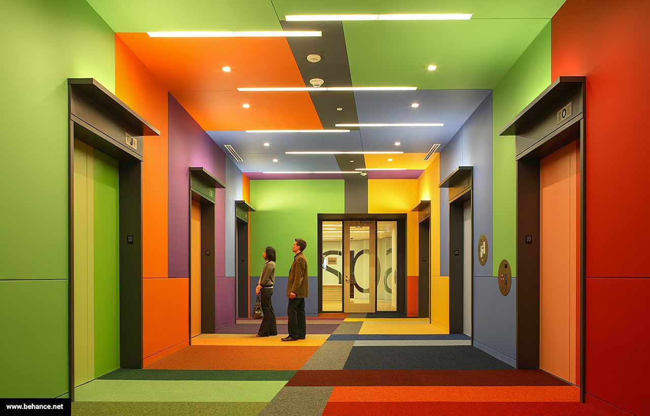
What do you see initially when you enter a room? Does it have anything to do with the furnishings, the illumination, or the wall texture? Colour is usually the deciding factor. Unbeknownst to us, colour is the architect's silent storyteller, influencing our feelings, actions, and choices. As a designer or architect, knowing the psychology of colour is essential for making places that people can relate to on a deeper level than merely looking at them.
Immerse yourself in the captivating realm of colour psychology as it pertains to architectural design. Discover how different hues have the power to alter environments, impact moods, and direct behaviour.
Colour psychology: the science behind it
"Colour psychology" is more than simply a passing fad; it has solid scientific foundations. Because of innate evolutionary tendencies, our brains are built to react in certain ways to different colours. When you see the colour red, you might get a sense of urgency or danger; on the other hand, when you see blue, you might think of tranquilly, like the sky or water.
Amplifying these emotions is what architecture is all about. Adding gentle blues and greens to a hospital room can transform it from clinical and impersonal to soothing and restorative. In the same way that a subdued grey might promote concentration and self-reflection, a lively orange accent wall might inspire vitality and innovation in a shared office.
Case Studies on Colour in Real-Life Environments
Let's have a look at some actual buildings where colour was a deciding factor:
The Salk Institute in California
The Salk Institute, a modernist architectural marvel, was designed by the legendary Louis Kahn. It exudes an air of timeless elegance and concentration because to its neutral colour scheme and use of warm, natural materials (such as warm wood tones and concrete grey). The lack of bright colours creates a perfect setting for scientific inquiry and new ideas since it lets the imagination wander freely.
_1739077563593.jpg)
The Salk Institute in California (Img Src: Arch Daily)
Stockholm's Yellow Office
Bright yellow accents were employed by designers to energise the surroundings in a busy Stockholm coworking location. Workers were more likely to work together and be enthusiastic because of the colour yellow, which is generally linked with optimism and innovation. A lesson in moderation, they countered the overstimulation with neutral tones.
Istanbul's Blue Mosque
The renowned Blue Mosque evokes feelings of peace and closeness to God with its thousands of blue tiles. The colour blue, which represents endless possibilities and tranquilly, adds to the holy ambiance, leaving worshippers feeling both humbled and lifted.
Color's Effects on Emotion and Action
1. Energy and Connection: Warm Colours
The energy-inducing and comforting properties of warm colors—red, orange, and yellow—are well-documented. Restaurants, cafes, and living areas frequently feature these colours in architectural design to entice customers to mingle and eat. But be careful not to overdo it, as it can cause agitation.
Hint To create an inviting atmosphere that encourages interaction and gathering, use warm colours with neutral undertones.
2. Relaxing and Concentrating Colour Schemes
Colours with a calming influence, such as blue, green, and purple, are perfect for areas that require relaxation or focus. Imagine study nooks, library stalls, or boardrooms. Green is a common choice for healthcare facilities since it is connected with nature and helps relieve stress.
Held Secret: Use cooler tones to help people concentrate, but inject some warm hues here and there to make it cosy and inviting rather than clinical and impersonal.

Istanbul's Blue Mosque
3. Coloured Neutrals: Harmony and Adaptability
White, grey, and beige are neutral colours that serve as a backdrop, letting the other parts of the design stand out. You can't go wrong with them for minimalist or modern designs because of how adaptable and classic they are. On the other hand, if you want to avoid a boring atmosphere, it might be a good idea to incorporate texture or subtle accents into the room.
Expert Tip: Work with muted tones as a foundation, then add pops of colour with accent pieces, artwork, or lighting to make a statement.
Thoughts on Culture and Setting
Not everyone is affected by colour psychology. Colour perception can be influenced by one's cultural background and life experiences. To illustrate the point, although white is often linked with grief in many Eastern cultures, it represents innocence and tranquilly in Western ones. Similarly, while red may denote passion or danger in some cultures, it can represent good fortune and wealth in China.
Architects and designers must always keep in mind the historical, social, and cultural relevance of colour when working on projects. Colours are powerful visual cues, therefore it's important to know your audience inside and out.
Real-World Advice on Colour Theory and Its Application to Building Design
1. Establish Your Objectives
Think about the room's function before settling on a colour scheme. Does it aim to energise, soothe, motivate, or direct attention? Allow the function to direct your selection of colours.
2. Let's Talk About Lighting!
The way colours look can be greatly affected by the lighting, both natural and artificial. Make sure your colour choices produce the desired impression by testing them in various lighting circumstances.
3. Expand Your Mindset
Nothing says "colour" like paint. Everything from building supplies to furnishings to artwork to landscape may be adorned with it. The effect of a vivid sculpture or verdant wall can be comparable to that of a painted surface.
4. Try New Things, But Always Remain Classic
Keep in mind that architecture is enduring, even though it's tempting to go with the latest colour fad. For rooms that seem to have aged gracefully, it's best to mix modern colours with classic neutrals.
Conclusion: Colour Strategies for User-centred Design
Colour is more than meets the eye; it has the ability to influence how we perceive the world. The colours you pick out can have a significant impact on people's emotions, actions, and interactions in any given location, be it a house, an office, or a public area.
"The mother art is architecture," famous architect Frank Lloyd Wright once remarked. Our civilisation lacks its spirit if it does not have its unique architecture. Colour is the lifeblood of a building, my friends.
Therefore, consider more than just the surface when choosing a material or painting a swatch. Consider: What is the story I would like this area to convey? So, how can I use colour to illustrate my story?
Which colour scheme in a building do you prefer? Post your opinions in the space provided; I'm interested in hearing your take on things!
The future of architecture is bright, but are your skills keeping pace? Kaarwan's architecture-specific courses provide you with the knowledge and tools to confidently navigate the AEC industry. Gain valuable insights, master in-demand software, and stand out with designs that impress!
FAQs
1. How does colour influence mood in architecture?
Answer: Colours evoke emotional responses—warm tones like red and orange energize, while cool tones like blue and green calm. Architects use this to shape how people feel in a space.
2. What are warm colours used for in design?
Answer: Warm colours (red, orange, yellow) create energy and warmth, making them ideal for social spaces like restaurants, cafes, and living rooms to encourage interaction.
3. Why are cool colours important in architecture?
Answer: Cool colours (blue, green, purple) promote relaxation and focus, making them suitable for spaces like offices, libraries, and healthcare facilities.
4. How does cultural context affect colour choices?
Answer: Colours have different meanings across cultures. For example, white symbolizes purity in the West but mourning in some Eastern cultures, so designers must consider cultural relevance.
5. What practical tips help in choosing colours for architecture?
Answer: Define the space’s purpose, test colours under different lighting, experiment with materials beyond paint, and balance trendy hues with timeless neutrals for lasting appeal.