

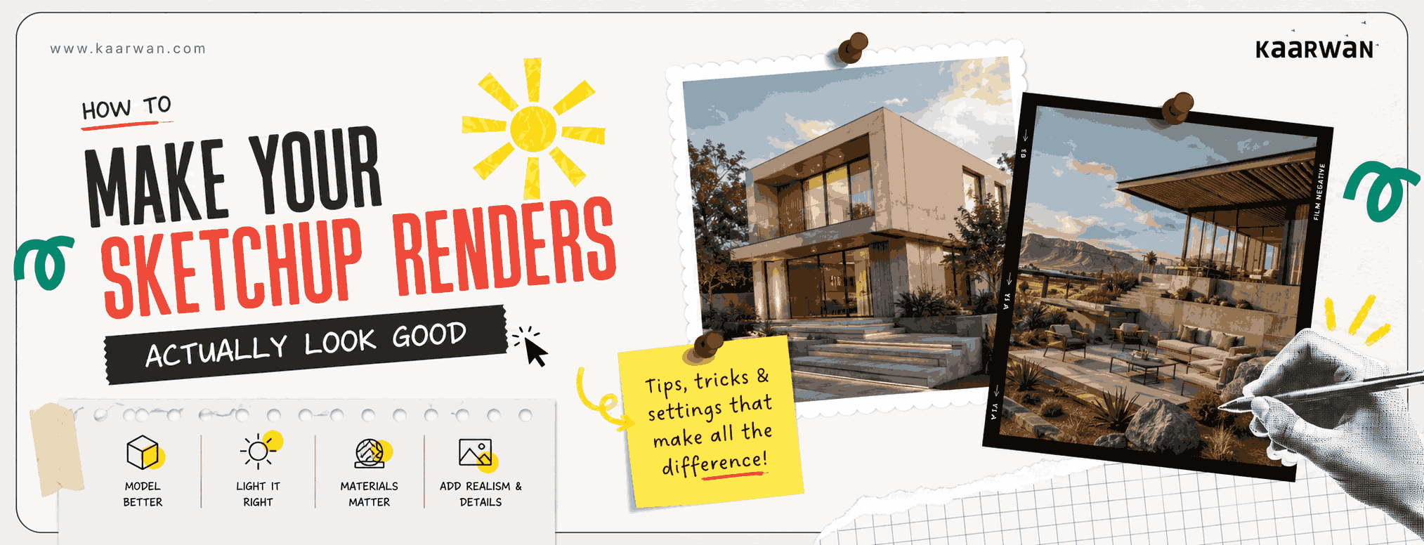
Every architecture student knows the feeling.
You've spent two days building the model. The geometry is clean, the proportions are right, you've even added entourage — people, trees, the works. You hit render. You wait. And what comes back looks like a screenshot from a video game made in 2009.
Flat. Grey. Unconvincing. Nothing like the atmospheric, light-drenched images you had in your head when you designed the thing.
Here's the truth nobody says out loud in the studio — a bad render doesn't just look bad. It actively undersells your design. It makes a thoughtful, resolved piece of architecture look like a rough sketch. And in a review, a portfolio, or a competition submission, your visual is often the first conversation your work has with the person looking at it.
The good news is that most renders fail for the same small, fixable reasons. You don't need a more powerful laptop. You don't need to switch software. You need to understand what's actually going wrong — and then fix it, deliberately.
The Problem Is Almost Always Light.
Not the model. Not the materials. Light.
Most students set up their render with the default sun position — noon, overhead, harsh. And overhead lighting is the most unflattering light that exists, in photography, in architecture, and in rendering. It flattens depth, kills shadows, and removes the one thing that makes a building feel real — the sense that light is actually moving through it.
Move your sun. Late afternoon, around 4-5 PM, with a low angle, will do more for your render than any material upgrade. Watch what happens to your shadows when the sun drops below 45 degrees. Suddenly, you have depth. Suddenly, the facade has texture. Suddenly, it looks like a place where time actually passes.
In V-Ray, spend time with your HDRI environment lighting before you touch anything else. A good HDRI adds ambient bounce, colour temperature, and atmospheric context that no artificial light setup can replicate. This one change alone will visibly and immediately improve the quality of your renders.
Your Materials Are Too Perfect. Make Them Messier.
Architecture school teaches you to think about materials in terms of specification — the right concrete, the right glass, the right timber. Rendering teaches you something different — that perfect materials look fake.
Real concrete has variation. Real timber has grain that catches light differently across its length. Real glass has slight reflections that shift with the angle. When every surface in your render is uniformly textured at the same scale, the brain registers it as artificial. Because it is.
In SketchUp with V-Ray, use bump maps and displacement maps alongside your diffuse textures. A subtle bump on a plastered wall will catch your directional light and create the kind of micro-shadow that makes a surface feel physical. Vary your material scale — the same brick texture applied at slightly different scales in adjacent walls reads as real in a way that perfect uniformity never does.
And for glass, never use a flat grey texture. Set up a proper V-Ray glass material with a low reflectivity value and a slight green tint in the refraction. It takes ten minutes. The difference is immediately visible.
Entourage Is Not Decoration. It's Scale and Life.
The trees and people in your render are doing more work than you think — but only if you use them correctly.
Foreground entourage creates depth. A tree branch cutting into the frame from the edge, slightly out of focus, tells the brain that this is a real place being observed from within it, not a diagram being viewed from outside. This is the difference between a render that feels like a photograph and one that feels like an elevation.
People establish scale and suggest occupation — they tell the viewer that this space is meant to be lived in. But generic, stiff, brightly-dressed 2D cutout people do the opposite. Use 3D people sparingly, positioned in natural postures, in contextually appropriate clothing. One person standing in the right place at the right scale does more for a render than twelve people scattered like tokens on a board game.
In V-Ray, use the proxy system for 3D entourage so your model doesn't slow to a crawl. And always — always — match the colour temperature of your entourage to your lighting. A person illuminated by warm afternoon sun should not cast a cold blue shadow.
Post-Processing Is Not Cheating. It's the Last 20%.
Every architectural visualisation professional post-processes their renders. Every single one. The render engine produces raw material — Photoshop or Lightroom turns it into a final image.
In post-processing, do three things at a minimum. First, adjust your levels — most renders come out slightly flat in contrast. A gentle S-curve in your levels will add depth without making the image look manipulated. Second, add a very subtle vignette — darkening the edges very slightly pulls the eye toward the centre of the composition and gives the image a sense of presence. Third, desaturate just a touch — real architectural photography is rarely fully saturated, and a slight desaturation makes a render feel more photographic and less digital.
These are not tricks. They are finishing work — the equivalent of sanding and sealing after construction. The building is already built. You're just making it look the way it deserves to.
The Render Is a Communication Tool, Not a Trophy.
This is the thing that separates students who render well from students who render purposefully.
A render is not proof that you can use the software. It's a communication tool — it's telling someone who wasn't inside your design process what it feels like to stand inside your building. Every decision you make — the time of day, the season, the weather, the angle, what's in the foreground — is a curatorial choice that shapes what the viewer understands about your design.
To Sum It Up
The best rendered images in any portfolio aren't the most technically impressive ones. They're the ones that make you feel something when you look at them. Light that makes you want to be in that space. A shadow that suggests time is passing. An atmosphere that makes the design legible in an instant.
That's what you're aiming for. And it's absolutely within reach — with the right skills and the right guidance behind you.
Explore Kaarwan's visualisation courses this summer →
Your next render doesn't have to look like it came from 2009. Start there.
FAQs:
1. What render engine works best with SketchUp for beginners?
For most beginners, V-Ray and Lumion are great starting points, offering a balance between quality and ease of use.
2. Is V-Ray too advanced for architecture students?
Not at all. It has a learning curve, but mastering V-Ray is one of the most valuable rendering skills students can develop.
3. Can I get good renders using only SketchUp's native tools?
For basic presentations, yes. But dedicated render engines produce far more realistic lighting, materials, and atmospheres.
4. How important is lighting in SketchUp renders?
Lighting can make or break a render. Even great models and materials will look weak if the lighting isn't working.
5. What's the difference between V-Ray and Lumion for rendering?
V-Ray offers greater realism and control, while Lumion focuses on speed, ease of use, and real-time visualisation.
6. How do I add realistic materials in SketchUp?
Use high-quality textures, proper scaling, and material maps such as bump and reflection maps where possible.
7. Why do my renders look flat even with good materials?
The issue is often lighting, camera composition, or a lack of contrast—not the materials themselves.
8. How long should a good render take to process?
Anything from a few minutes to several hours, depending on image quality, scene complexity, and hardware.
9. Should I post-process my renders in Photoshop?
Yes. Subtle adjustments to contrast, colour, and atmosphere can significantly improve the final image.
10. What resolution should I export my renders at for a portfolio?
For most portfolios, export at least 3000–4000 pixels on the longer side to ensure sharp, professional-quality images.




.png)