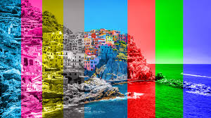
RGB vs. CMYK: What Every Designer Needs to Know
When it comes to design, colors are more than just shades on a screen — they’re systems of communication. Two of the most important color models every architect, designer, or creative professional must know are RGB and CMYK. While they might seem interchangeable, their purpose and application are very different.
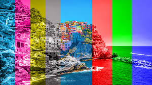
What is RGB?
- Stands for: Red, Green, Blue
- How it works: RGB is an additive color model. It starts with black and adds light (red, green, and blue) in varying intensities to create different colors.
- Where it’s used: Anything that emits light—like computer screens, smartphones, TVs, and digital presentations.
- Key trait: Produces vivid, bright, and glowing colors that pop on digital displays.
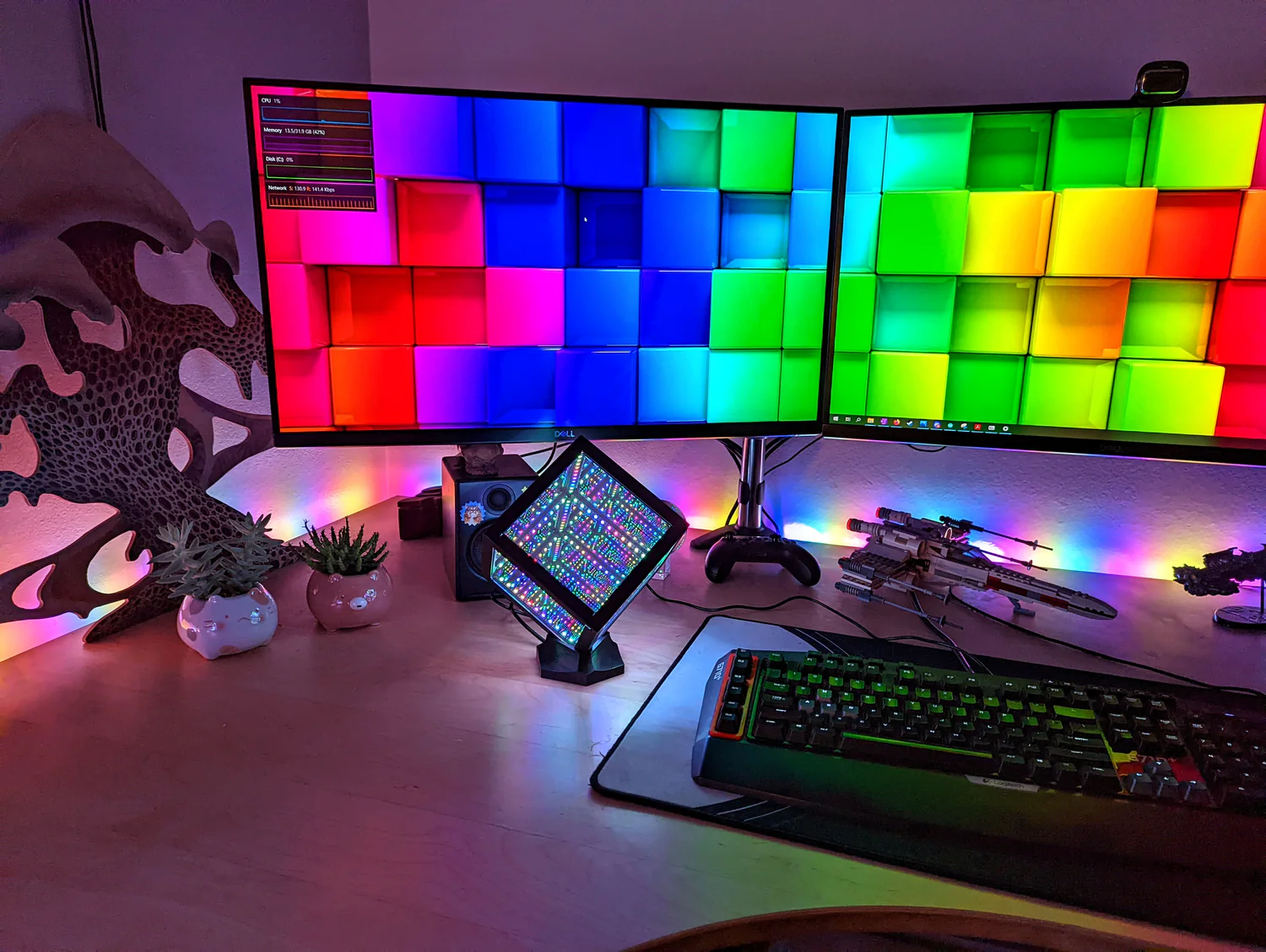
Example: That neon-green render on your laptop looks stunning because it’s RGB-based.
What is CMYK?
- Stands for: Cyan, Magenta, Yellow, Key (Black)
- How it works: CMYK is a subtractive color model. It starts with white (paper) and subtracts light by layering ink to create colors.
- Where it’s used: Print media—posters, brochures, architectural boards, magazines, packaging.
- Key trait: Produces accurate, stable, print-friendly colors but often less vibrant than RGB.
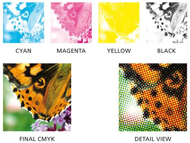
Example: That same neon-green render will look a bit muted when printed because CMYK can’t reproduce RGB’s full brightness.
RGB vs. CMYK — The Core Difference
- RGB = Light-based colors (Digital)
- CMYK = Ink-based colors (Print)
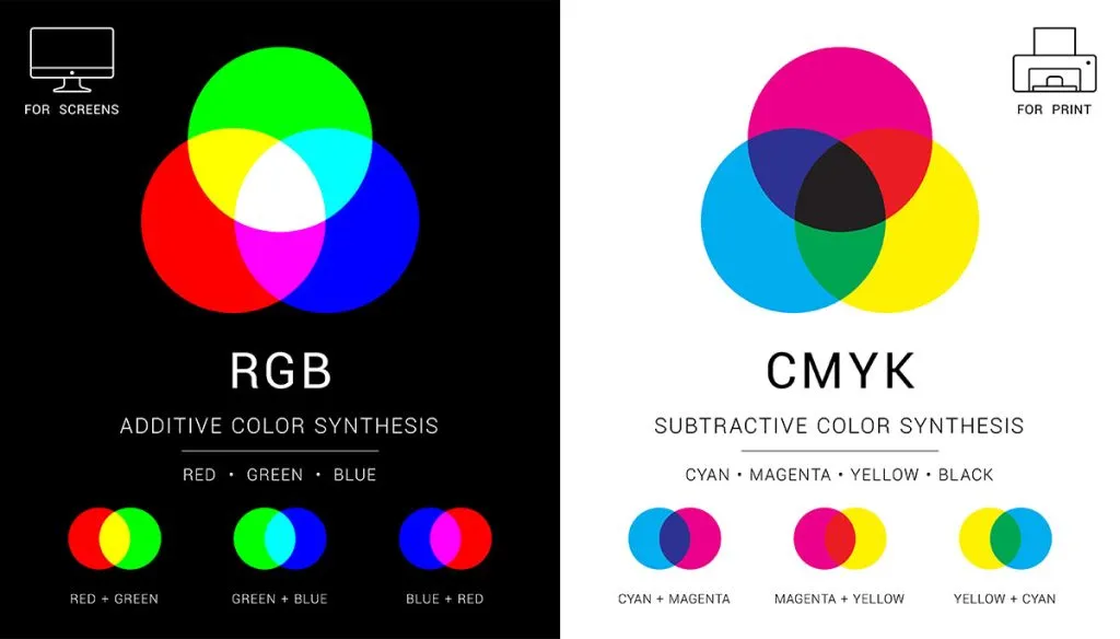
RGB offers a wider color gamut (more vibrant range), while CMYK ensures realistic and consistent printing results.
Why This Matters for Designers & Architects
- If you’re designing a digital presentation or portfolio, work in RGB.
- If you’re creating print boards, posters, or books, convert files to CMYK before sending to print.
- Ignoring this can cause color mismatches—what looks glowing on screen may turn dull in print.
Pro Tip
Always ask your printer for a color proof before finalizing. This ensures your blues don’t suddenly look purple and your vibrant reds don’t turn brick.