Color is one of the most powerful tools in UX design. It doesn’t just enhance aesthetics—it shapes user perceptions, triggers emotions, and influences behavior. The right color choices can improve usability, increase conversions, and strengthen brand identity.
Think about how red makes you feel excited, or how blue gives a sense of calm. This isn’t a coincidence. Color psychology explains how different hues evoke different emotions, directly impacting user interactions with digital products.
But how does color influence decision-making? And how can designers use it effectively to optimize user experience and drive engagement? This article explores the science behind color psychology in UX, practical applications, and best practices to create emotionally resonant designs.
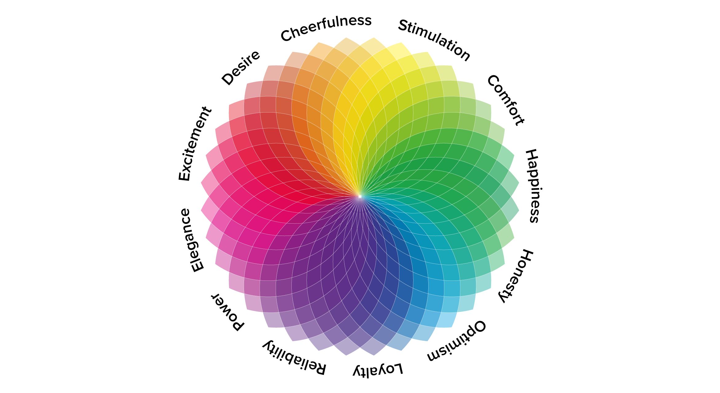
Image Credits - Toptal
The Science Behind Color Psychology in UX
Our brains process visual information 60,000 times faster than text. Color is one of the first things users notice, often within 90 seconds of interaction. In that short span, color can influence trust, engagement, and conversions.
Psychologists believe colors trigger subconscious associations based on culture, personal experiences, and evolutionary factors. While interpretations can vary, general emotional responses remain consistent across audiences.
Here’s how common colors impact user emotions:
1. Red: Urgency, Energy, Passion
- Increases heart rate and appetite (often used in food brands).
- Creates urgency (e.g., sale banners and call-to-action buttons.
- Example: Netflix uses red to evoke excitement and action.
2. Blue: Trust, Calm, Security
- Associated with reliability and professionalism (used in banking and healthcare).
- Lowers stress and enhances focus.
- Example: Facebook, PayPal, and LinkedIn use blue to establish trust.
3. Green: Balance, Growth, Health
- Symbolizes nature, wellness, and harmony.
- Often used for eco-friendly and finance brands.
- Example: Spotify and Whole Foods use green for creativity and sustainability.
4. Yellow: Optimism, Warmth, Attention
- Grabs attention quickly (used in warnings and promotions).
- Evokes happiness and positivity, but excessive use can cause anxiety.
- Example: McDonald's uses yellow for a welcoming, energetic feel.
5. Black: Luxury, Power, Sophistication
- Conveys elegance and exclusivity (high-end brands often use it).
- Enhances contrast and readability in UI design.
- Example: Apple and Chanel use black for a sleek, premium look.
6. White: Simplicity, Cleanliness, Minimalism
- Associated with clarity, openness, and modernity.
- Used in minimalist UX designs for focus and readability.
- Example: Apple’s clean interface leverages white space to enhance usability.
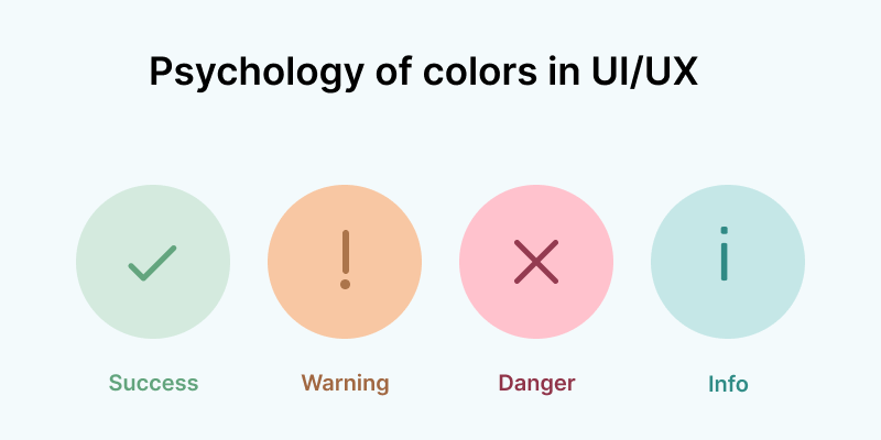
Image Credits - Proche
How Colors Influence User Behavior in UX Design
1. Call-to-Action (CTA) Optimization
CTAs are crucial for user engagement. The right color choice can boost conversions significantly.
- Red & Orange – Best for urgency-driven actions (e.g., “Buy Now,” “Limited Offer”).
- Green – Works well for positive actions (e.g., “Start Free Trial”).
- Blue – Encourages trust, making it ideal for “Sign Up” or “Learn More” buttons.
2. Navigation & Readability
Color guides user navigation by creating visual hierarchy. Proper contrast ensures text readability and accessibility.
- Dark text on a light background improves readability.
- Accent colors highlight important sections (e.g., hover effects).
- Neutral backgrounds reduce cognitive load, enhancing focus.
3. Brand Identity & Recognition
Color plays a key role in brand recall. Studies show that color increases brand recognition by up to 80%.
- Consistent brand colors across websites, apps, and marketing materials create trust and familiarity.
- Example: Coca-Cola’s red branding is instantly recognizable, reinforcing energy and excitement.
4. Emotional Triggers & Conversions
Different industries leverage color psychology based on user expectations and emotions.
- E-commerce: Red and orange for urgency, green for “Buy Now” buttons.
- Finance: Blue for trust, green for stability.
- Health & Wellness: Green for calmness, white for cleanliness.
Example: Amazon’s “Add to Cart” button is bright yellow, drawing attention instantly.
Best Practices for Using Color in UX Design
1. Prioritize Accessibility
Not all users perceive color the same way. 8% of men and 0.5% of women have color blindness.
- Use high contrast for readability (avoid light text on a light background).
- Combine color with icons, labels, and patterns for differentiation.
- Test designs using color blindness simulators to ensure inclusivity.
2. Follow the 60-30-10 Rule
A balanced color scheme improves visual harmony.
- 60% – Primary color (background or dominant areas).
- 30% – Secondary color (navigation, UI elements).
- 10% – Accent color (CTAs, highlights).
3. Maintain Consistency Across Platforms
Users should recognize a brand’s identity instantly.
- Use the same color palette across websites, apps, and marketing materials.
- Define brand guidelines to ensure cohesive design language.
4. A/B Test Color Variations
Colors impact conversion rates, but results vary by audience.
- Conduct A/B tests on CTA buttons, backgrounds, and navigation.
- Analyze heatmaps to track color engagement patterns.
- Adjust colors based on real user behavior, not just design theory.
5. Use Colors to Guide User Flow
Strategic color placement directs attention and enhances usability.
- Highlight active elements (e.g., current page, selected menu items).
- Use contrasting colors for buttons to stand out.
- Apply muted colors in secondary actions to reduce distractions.
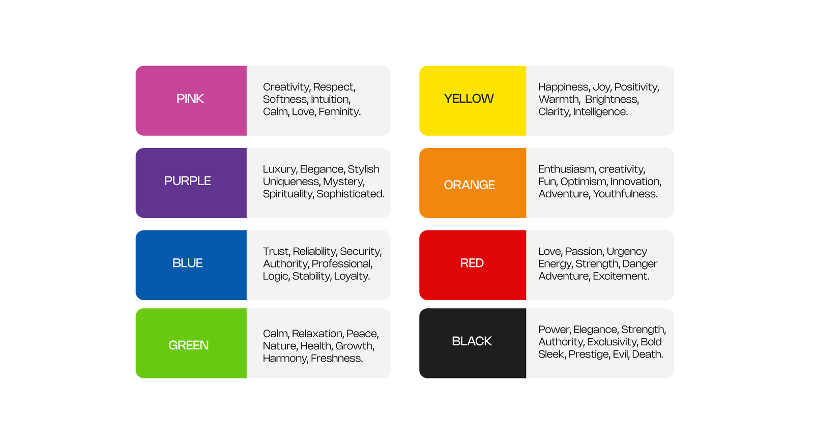
Image Credits - OpenReplay
What you'll learn:
- Learn from industry experts and master practitioners.
- Engage in hands-on, project-based learning experiences.
- Connect with a vibrant community of creatives and professionals.
- Receive a certificate to boost your portfolio and credentials.
Conclusion
Color isn’t just about aesthetics—it’s a psychological tool that influences emotions, behavior, and usability. By understanding color psychology in UX, designers can create intuitive, engaging experiences that enhance user satisfaction and brand perception.
From driving conversions with CTAs to establishing trust with branding, the right color strategy shapes how users interact with digital products. But ethical design matters—prioritizing accessibility and usability ensures that color choices benefit all users.
So, the next time you design a website or an app, think beyond visuals—use color to tell a story, evoke emotion, and guide user behavior.
Level up your UI/UX skills! Learn to create stunning interfaces and seamless user experiences with our Advanced UI/UX Design Course. Boost your career and design products that stand out.
Enroll today at Kaarwan for more insights!
FAQs
1. How does color influence user behavior in UX design?
Colors trigger emotions and decisions, influencing engagement, trust, and conversion rates. Bright colors drive urgency, while cool colors establish calmness and trust.
2. What is the best color for call-to-action (CTA) buttons?
Red, orange, and green are most effective for CTAs. Red and orange create urgency, while green signals positive action.
3. Why is color contrast important in UX?
Contrast improves readability and accessibility, ensuring that users with visual impairments can interact with digital interfaces effectively.
4. How can I choose the right color scheme for my website?
Follow the 60-30-10 rule, maintain brand consistency, and test color variations to see what resonates best with users.
5. How does color affect brand identity?
Color increases brand recognition by 80%, shaping user perception and emotional connections with a brand.