Japanese aesthetics have long been admired for their simplicity, elegance, and harmony. Rooted in centuries-old traditions, these principles have influenced art, architecture, and product design globally. In the digital age, these aesthetics are shaping modern UI design, offering a refined approach to usability, minimalism, and user engagement.
From Zen-inspired simplicity to the delicate balance of asymmetry, Japanese design philosophy aligns seamlessly with user-centered digital experiences. This blog explores how Japanese aesthetics influence UI design, providing insights into how these timeless principles can enhance digital interfaces.
Key Japanese Aesthetic Principles in UI Design
1. Ma (間) – Embracing Space and Silence
Ma refers to the intentional use of negative space, creating a sense of balance and tranquility. Unlike Western design, which often focuses on filling space with elements, Ma emphasizes what is left out.
How Ma Shapes UI Design:
- Clean layouts with generous spacing enhance readability and focus.
- Simplified interfaces reduce cognitive load, helping users navigate effortlessly.
- White space guides the eye, directing attention to key actions and content.
Apple’s website is a prime example of Ma in digital design. Its minimalist approach, ample spacing, and refined typography create an immersive yet clutter-free experience.
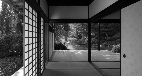
Image Credit - Dans Le Gris
2. Wabi-Sabi (侘寂) – The Beauty of Imperfection
Wabi-Sabi is a philosophy that finds beauty in imperfection, transience, and authenticity. It embraces asymmetry, organic textures, and simplicity, encouraging a more human-centered approach to design.
How Wabi-Sabi Translates to UI:
- Hand-drawn elements, natural color palettes, and soft textures create a more relatable experience.
- Subtle irregularities, like slightly asymmetrical layouts, add warmth and character.
- Dynamic UI components that evolve over time (e.g., personalized dashboards) align with the transient nature of Wabi-Sabi.
Brands like Muji apply Wabi-Sabi in their digital presence, using muted tones, raw textures, and unembellished layouts to reflect simplicity and authenticity.
3. Shibui (渋い) – Understated Elegance
Shibui is about refined beauty—design that is not overly decorative but remains sophisticated and engaging. It avoids unnecessary complexity while maintaining depth.
Shibui in UI Design:
- Muted color schemes with subtle contrasts create a calming effect.
- Functional design without excessive embellishment ensures a seamless experience.
- Thoughtful typography choices enhance clarity without being overly bold.
Google’s Material Design subtly integrates Shibui by balancing simplicity with thoughtful micro-interactions, ensuring smooth user engagement.
4. Fukinsei (不均整) – Asymmetry for Natural Flow
Fukinsei celebrates asymmetry as a way to create dynamic visual interest. Unlike rigid grid-based structures, Fukinsei introduces organic movement and spontaneity.
UI Design Applications:
- Asymmetrical layouts guide users naturally through content.
- Unevenly spaced elements create a rhythm that keeps interfaces engaging.
- Visual hierarchy is enhanced through carefully unbalanced compositions.
Web design trends increasingly favor asymmetry, as seen in modern portfolio websites that break traditional grid structures to create more immersive user journeys.
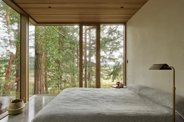
Image Credit - Love That Design
5. Kanso (簡素) – Simplicity Without Sacrifice
Kanso emphasizes simplicity—not as a lack of detail, but as a refined reduction to essentials. It eliminates clutter while maintaining function and beauty.
Kanso in Digital Interfaces:
- Minimal UI with intuitive navigation removes distractions.
- Limited color palettes focus on usability rather than excess.
- Crisp, well-structured layouts prioritize essential content.
Spotify’s UI embodies Kanso by offering an uncluttered interface while maintaining intuitive user interactions.
How Japanese Aesthetics Enhance UI/UX
1. Creating Calm and Focused User Experiences
In a world where digital overload is common, Japanese-inspired design offers a breath of fresh air. Minimal interfaces reduce visual noise, making interactions more meaningful and less overwhelming.
For instance, meditation apps like Headspace use calming colors, spacious layouts, and subtle animations to create an environment that aligns with Zen-like tranquility.
2. Enhancing User Engagement Through Simplicity
Complexity can lead to user frustration. By embracing Kanso and Ma, UI designers create fluid experiences where users intuitively know where to click, scroll, or interact.
E-commerce platforms like Uniqlo utilize straightforward navigation, large imagery, and limited text to streamline the shopping experience, making browsing effortless.
3. Improving Aesthetic Longevity
Unlike trendy, short-lived design styles, Japanese aesthetics focus on timeless beauty. Interfaces built around these principles remain visually appealing even as design trends evolve.
For example, Apple's iOS design, inspired by Japanese minimalism, maintains its sleek and intuitive appearance year after year.
4. Encouraging Emotional Connection
A UI that reflects Wabi-Sabi principles—authentic, organic, and slightly imperfect—feels more human. This fosters trust and emotional engagement, making users feel more connected to a brand or product.
Brands that adopt this approach, such as Japanese tea brands with hand-drawn UI elements, create an emotional bridge between tradition and technology.
Implementing Japanese Aesthetic Principles in UI Design
1. Prioritize White Space
Avoid overcrowding the interface. Allow elements to breathe, ensuring a smooth and enjoyable browsing experience.
2. Use a Muted, Natural Color Palette
Earthy tones, soft neutrals, and minimal contrast evoke a sense of calm and balance.
3. Focus on Essential Functionality
Every design element should serve a purpose. Remove unnecessary features that do not enhance usability.
4. Introduce Subtle Asymmetry
Experiment with slight imbalances in layouts to create a more organic, natural flow.
5. Incorporate Organic Textures and Hand-Crafted Elements
Digital interfaces don’t have to feel mechanical. Soft textures, natural curves, and subtle irregularities make interfaces feel more inviting.

Image Credit - Decorilla
Conclusion
Japanese aesthetics offer a powerful framework for UI design, promoting simplicity, elegance, and a human-centered approach. By integrating principles like Ma, Wabi-Sabi, and Kanso, designers can create interfaces that are not only visually appealing but also deeply intuitive.
As digital interactions become more immersive, the wisdom of Japanese design continues to influence how we create meaningful, lasting user experiences. Whether through minimalism, asymmetry, or natural imperfection, these principles shape the future of UI design in a way that is both timeless and functional.
Level up your UI/UX skills! Learn to create stunning interfaces and seamless user experiences with our Advanced UI/UX Design Course. Boost your career and design products that stand out.
Enroll today at Kaarwan for more insights!
FAQs
1. How do Japanese aesthetics influence UI design?
Japanese aesthetics promote simplicity, balance, and natural flow, making interfaces more intuitive and engaging by reducing clutter and enhancing user focus.
2. What is Ma in UI design?
Ma refers to the intentional use of negative space, creating a balanced and spacious interface that improves readability and user experience.
3. How can Wabi-Sabi be applied to digital design?
Wabi-Sabi embraces imperfection, asymmetry, and authenticity, allowing designers to create more human-centered and emotionally engaging digital experiences.
4. Why is minimalism important in UI design?
Minimalism, inspired by Japanese principles like Kanso, simplifies interfaces, reduces distractions, and improves usability, leading to better user experiences.
5. How can I incorporate Japanese design principles into my UI?
Focus on white space, muted colors, asymmetry, essential functionality, and subtle organic elements to create a UI that aligns with Japanese aesthetics.