So you've got an interview lined up. Maybe it's tomorrow. Maybe it's in three days and you've already refreshed your portfolio link twelve times just to make sure it still loads. Either way, you're here because you want to walk in knowing what's coming , not guessing.
Good news: UI/UX interviews, for all their reputation of being "vibes-based," actually follow a pretty predictable shape. Once you know the shape, the questions stop feeling random and start feeling like things you can actually prepare for.
This is a full rundown of ui ux interview questions you're realistic to be asked in 2026 , from the basic UI vs UX stuff to the portfolio round that trips up almost everyone. We've also leaned on patterns our own mentors and alumni have seen across real Kaarwan portfolio reviews, because that's the round most guides skim past and honestly, it's the one that decides most offers.
Let's get into it.
How UI/UX Interviews Are Structured
Before the questions, it helps to know the shape of the thing you're walking into. Most UI/UX design interview processes , whether it's a 50-person startup or a large product company , run through some version of these four stages:
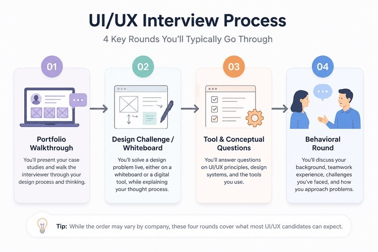
- Portfolio walkthrough. You present 1-2 case studies. This is usually 30-45 minutes and it's the round that carries the most weight.
- Design challenge or whiteboard exercise. Either live (30-60 minutes) or a take-home brief with a short deadline.
- Tool and conceptual questions. Quick-fire stuff to check you actually know your Figma from your Fibonacci.
- Behavioral round. Usually with a PM, an engineering lead, or a design manager, focused on how you work with people.
Not every company runs all four. Smaller teams sometimes fold the portfolio round and behavioral questions into one conversation. Bigger companies stretch this across 3-4 separate calls over two or three weeks. Either way, expect the order above roughly , because it mirrors the actual design process: understand → explore → execute → collaborate.
One thing worth internalizing early: interviewers aren't grading you on having the "correct" answer. There usually isn't one. They're grading how you think out loud, whether you can justify a decision, and whether you'd be someone they'd actually want in a room during a messy product debate.
Also explore: Low vs high-fidelity prototypes , choosing the right approach
Conceptual Questions (UI vs UX Fundamentals)
These show up in almost every UI/UX design interview questions and answers list you'll find, and for good reason , they're the baseline check. If you fumble these, the interviewer starts wondering what else might be shaky.
1. What's the actual difference between UI and UX?
UX is the experience , how a product feels to use, whether it makes sense, whether the flow gets someone from point A to point B without friction. UI is the visual layer that sits on top of that experience , colors, type, spacing, the buttons themselves. A decent way to frame it in an interview: "UX decides whether the button should exist and what it should do. UI decides what it looks like and how it feels to tap."
2. Walk me through your design process.
Most interviewers want to hear some version of: research → define → ideate → design → test → iterate. Don't recite it like a textbook though , anchor it to an actual project. "On my last project I started with five user interviews, which told me X, which shaped the wireframes I built next..." Specifics beat definitions every time.
3. What are usability heuristics, and can you name a few?
Nielsen's 10 heuristics are the standard reference , things like visibility of system status, consistency, error prevention, and user control. You don't need to recite all ten from memory. Pick three you actually apply and explain how, with an example from your own work.
4. What's the difference between usability and accessibility?
Usability is about how easy something is to use for the average person. Accessibility is about making sure people with disabilities , visual, motor, cognitive , can use it too. Mention WCAG 2.1 AA if you can, and the 4.5:1 contrast ratio if it's relevant. Interviewers like it when accessibility doesn't sound like an afterthought in your answer.
5. What's a wireframe versus a prototype?
Wireframe: skeleton, structure, no visual polish. Prototype: something clickable that simulates the real flow, used to test before development starts. Simple distinction, but say it cleanly.
6. What is information architecture?
It's how content is organized and labeled so people can find what they need without thinking too hard. A good answer references the three questions users unconsciously ask on any screen: where am I, where can I go, what's here.
7. What's a design system, in your own words?
Not just a style guide. It's a shared library of reusable components, tokens, and documentation that keeps a product consistent as it scales. If you've contributed to one , even a personal one for a course project , say so.
8. How do you decide which user research method to use?
Surveys for scale and quantitative patterns. Interviews for depth and the "why" behind behavior. Usability testing to catch where people actually get stuck. Tie the method to the question you're trying to answer, not the other way around.
9. What's visual hierarchy, and how do you build it?
Size, contrast, spacing, position , the tools that tell someone's eye where to land first. "If everything's emphasized, nothing is" is a decent line to have ready here.
10. What are Gestalt principles, and where have you used them?
Proximity, similarity, continuity, closure. You don't need all of them , pick two and describe a screen where grouping elements a certain way actually solved a real problem.
Also read: What to expect once you land the role , salary negotiation for UI/UX designers
Tool-Based Questions
This section is where interviewers separate people who say they know Figma from people who actually live in it.
1. Walk me through your Figma workflow on a typical project.
Talk about your file structure, how you use frames and pages, and whether you keep separate files for exploration versus final delivery. Messy answers here are a red flag , organization signals professionalism more than people realize.
2. What's Auto Layout, and when do you use it?
It's Figma's way of making elements resize and reflow responsively without manual repositioning. Mention how it saves time on components like buttons, cards, and lists that need to adapt across screen sizes.
3. How do you build and manage reusable components?
Talk about component variants, nested components, and how you name and organize them so a team (not just you) can use them without confusion. "Btn / Primary / Hover" beats "Frame 142" , always.
4. How do you approach handoff to developers?
Mention Figma's Dev Mode, annotating edge cases (error states, empty states, loading states), and staying available after handoff instead of disappearing once the files are shared.
5. Low-fidelity or high-fidelity , when do you use each, and why?
Lo-fi for fast, cheap exploration when structure is still up for debate. Hi-fi once the flow is validated and you're testing visual design or presenting to stakeholders. Going straight to hi-fi is a common beginner mistake , call it out if you've made it and learned from it.
6. Have you used FigJam or Miro?
For what? Usually for journey mapping, workshops, or affinity diagramming with a team. If you haven't used either, be honest and mention what you'd use them for.
7. What's your process for testing a prototype with real users?
Cover recruiting a handful of representative users (five is the commonly cited number that surfaces most usability issues), giving them tasks rather than instructions, and observing without steering them.
8. How do you keep design files version-controlled and organized across a team?
Branching in Figma, clear naming conventions, and a shared component library. If this feels vague to you right now, it's worth practicing before your interview , it comes up more than people expect.
Gain real world UI/UX experience through live projects, personalized mentorship, and career guidance with Kaarwan's UI/UX Design Certification & Job Support Program.
Portfolio & Case Study Questions
Here's the part most guides brush past, and it's honestly the round that decides most outcomes. A huge chunk of hiring decisions in UI/UX get made in the first 15 minutes of a portfolio walkthrough , before the design challenge even starts. If your case study rambles, the rest of the interview is playing catch-up.
So what actually happens in this round? You're usually given 30-45 minutes to walk through one or two projects, and the interviewer interrupts , a lot. That's normal. They're not being difficult; they're checking whether your explanation holds up under a follow-up question, which is exactly what happens in real design reviews.
From patterns we've seen across real Kaarwan portfolio-review sessions with mentors and alumni, a few things come up again and again:
- "Why this solution and not the other one?" , Interviewers almost always ask about the option you didn't pick. If you can't name an alternative you considered, it looks like you landed on the first idea and stopped there.
- "What would you have tested if you'd had more time?" , This checks whether you know the difference between a finished project and a project that just ran out of runway.
- "Talk me through a moment where the data or feedback surprised you." , This is the one that separates people who did real research from people who did research to justify a decision they'd already made.
Also read: Prototyping in UI/UX , the secret to user-friendly design
If you don't have a clean answer to those three, that's exactly where to spend your prep time this week.
A few structural things that consistently work in the walkthrough:
- Lead with the problem, not the screens. "Users were dropping off at checkout" lands better than "I designed this checkout flow."
- Narrate your reasoning, not just your steps. Don't just say what you did , say why, and what you were trying to protect against.
- Have a number ready, even a small one. Task completion rate, drop-off reduction, time-on-task , anything that shows the work moved a needle, even in a student project.
- Don't apologize for early-stage work. If you're a fresher, it's fine that your project doesn't have shipped metrics. Interviewers know this. What they're checking is whether your reasoning was sound, not whether the company adopted your redesign.
If you're still assembling your case studies, it's worth spending real time on building your portfolio before the interview and getting familiar with structuring your case studies properly , the format genuinely changes how an interviewer receives the story, regardless of how good the underlying work is.
Behavioral / Situational Questions
These are less about design knowledge and more about whether you're someone a team can actually work alongside. Use the STAR method , Situation, Task, Action, Result , to keep answers tight instead of rambling into a five-minute story that loses the point halfway through.
1. Tell me about a time you disagreed with feedback from a stakeholder or teacher.
Don't say "I just did what they asked." Show that you pushed back with reasoning or data, and if you still had to compromise, explain how you did it without being difficult about it.
2. How do you handle a developer telling you a design is too hard to build?
Talk about sitting down with them, understanding the actual constraint, and co-creating a simpler version together rather than insisting on the original.
3. Describe a project that didn't go the way you planned.
Own the miss honestly, then pivot fast to what you changed afterward. Interviewers remember the recovery, not the mistake.
4. How do you handle tight deadlines when your research isn't finished?
Show that you can be pragmatic , swap a longer research method for something faster (a one-day hallway test instead of a two-week study, for instance) rather than freezing up.
5. Tell me about a time you had to explain a design decision to someone non-technical.
Focus on the analogy or visual aid you used, not the jargon you avoided.
Also explore: UI-UX design testing and iteration guide
Questions for Freshers vs Experienced Designers
The bar shifts depending on where you are, and interviewers know it. Here's roughly what's expected at each stage:
Freshers / interns (0-2 years): Expect more conceptual and process-based ui ux interview questions for freshers, plus questions about coursework or personal projects. Interviewers aren't expecting shipped metrics , they're checking curiosity, whether you can accept feedback without getting defensive, and whether your design thinking is genuinely sound underneath the polish. "What would you do differently" comes up a lot here, and it's a chance to show growth, not a trap.
Mid-level (2-5 years): The conversation shifts from "how did you design it" to "why did you design it that way." Expect more on collaboration, autonomy, and whether you can ship without hand-holding. They'll probe constraints more , technical limitations, scope cuts, deadline pressure.
Senior (5+ years): Strategy and business impact take over. Expect questions on ROI, mentoring junior designers, influencing roadmaps, and managing conflicting stakeholder priorities. "How the button looks" stops being interesting; "how the button improved retention" is what they actually want to hear.
Questions to Ask the Interviewer
An interview runs both directions , you're evaluating the company just as much as they're evaluating you, even if it doesn't always feel that way. Asking sharp questions also just makes you look more prepared. A few worth having ready:
- "What does the design team's process actually look like day to day, not just on paper?"
- "How much influence does design have over roadmap decisions here?"
- "What's the biggest UX challenge the team is currently stuck on?"
- "What would success look like for this role in the first 90 days?"
Avoid asking things you could've found on their website in thirty seconds , it signals you didn't bother to look.
Interviews are, at the end of the day, just structured conversations about how you think. Once you've got a couple of solid case studies ready, know your reasoning cold, and you're not caught off guard by the format , the rest is just showing up and talking through work you've already done. That part's the easy bit.
Turn your design skills into a job ready portfolio with Kaarwan's UI/UX Design Certification & Job Support Program, featuring industry projects, expert mentorship, and placement support.
FAQ
How do I prepare for a UI/UX portfolio review?
Pick your two strongest projects, not your five most polished ones. Practice narrating each one out loud , problem, research, decisions, outcome , until it takes 10-12 minutes without notes. Then prepare for the follow-up questions: what you'd change, what alternatives you considered, and what surprised you along the way.
What do interviewers look for in entry-level UI/UX candidates?
Curiosity, sound reasoning, and how you respond to pushback , not shipped metrics. They're checking whether your thinking holds up when questioned, not whether your project went live.
Is a design challenge always part of the interview?
Not always, but it's common enough that you should prepare for one regardless. Some companies run a live 30-60 minute whiteboard exercise; others send a take-home brief with a short deadline. Either way, the evaluation criteria is the same: how you handle ambiguity, not whether you land on a "correct" answer.
How technical do UI/UX interviews get?
It depends on the role and company, but most interviews expect solid fluency in Figma, a working understanding of handoff to developers, and basic accessibility knowledge (WCAG, contrast ratios). You're rarely expected to write code, but you are expected to understand technical constraints well enough to design around them.